Blog

How to Reset a Room Seasonally Without Redecorating the Whole Space

TLDR

The most effective seasonal room refresh ideas change one functional layer and one visual layer. First, adjust the room for what you will do there this season—reading, hosting, homework, relaxing, or managing coats and shoes. Then add one restrained visual update, such as a textile, color accent, lighting change, or freshly styled surface. You do not need to replace the furniture or decorate every corner.

A seasonal reset works best when it feels like editing rather than shopping. Remove what no longer serves the room, test any layout changes, improve the lighting where people actually need it, and finish with a limited palette or texture. That sequence gives you a more useful room as well as a prettier one.

Choose the right size of refresh

Before pulling everything off the shelves, decide how much time and disruption you want. A clear limit prevents a quick refresh from turning into an unfinished weekend project.

  • 30-minute reset: Clear one surface, remove out-of-season accessories, switch on better task lighting, and add one textile or natural element.
  • Two-hour update: Do the quick reset, then restyle a shelf, rotate artwork, rearrange a small furniture grouping, or organize one problem zone.
  • Half-day DIY refresh: Add a carefully tested paint detail, relabel seasonal storage, hang or rotate art, and make a measured layout change.

For most rooms, the two-hour version is the sweet spot. It is long enough to create a visible difference but short enough that you are unlikely to leave the room in pieces.

Start with the room’s seasonal job

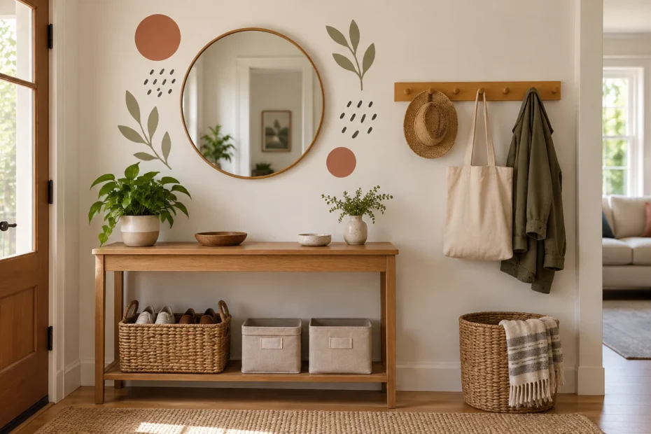
Ask what the room needs to do during the next few months. A living room might need a reading corner during darker months and more open seating for summer gatherings. A dining area may become a homework zone during the school year. An entryway may need room for wet shoes, sun hats, or bulky coats depending on the season.

Choose one job and let it guide the reset. If the goal is reading, concentrate on a comfortable seat, a reachable table, and useful light. If the goal is hosting, clear walking routes and create places for drinks before buying decorative accessories. Function gives the visual changes a reason to exist.

Seasonal room refresh ideas by common problem

What feels wrong First move Seasonal finish Mistake to avoid
Dark or flat Add light where you read, work, or gather Use a lighter textile or one reflective accent Adding several tiny lamps without improving usable light
Cluttered Empty and edit one visible surface Display a small group in a limited palette Buying containers before deciding what stays
Cold or sterile Add one soft or tactile layer Try a throw, cushion cover, basket, or curtain Covering every surface with texture
Overfull Remove one small furniture piece or decor group Leave deliberate open space Replacing removed items immediately
Boring but functional Create one focal point Rotate art or restyle one shelf Adding unrelated accents around the entire room
Disorganized Assign a home to daily-use objects Add room-specific bins or labels Using vague catch-all storage for everything

Follow the reset sequence

1. Remove before you add

Take out obvious seasonal pieces, expired paperwork, stray objects, and anything waiting to be returned to another room. Put uncertain items in an edit-later basket rather than letting indecision stall the project. If you do not miss those objects after a week or two, store, donate, or relocate them.

Clean the newly exposed surfaces before styling them. Dusty shelves and crowded tabletops can make a room feel tired even when the decor itself is attractive.

2. Test the layout instead of guessing

Photograph the existing arrangement before moving furniture. Then use painter’s tape, flattened boxes, or sheets of paper to mark a proposed furniture footprint. Open nearby doors and drawers, sit in each seat, and walk the routes you use every day. This is more reliable than adopting a universal clearance number that may not fit your room or household.

In a small room, resist pushing in another accent table or storage unit simply because the floor looks temporarily empty. A larger, cohesive foundation can sometimes make the space feel calmer than several small pieces. If the rug is part of the problem, use this guide to choosing a rug size for a small room before changing the surrounding furniture.

If you move a dresser, tall shelving unit, television, or similar furniture, check its anchoring afterward. The U.S. Consumer Product Safety Commission recommends securing dressers and other applicable furniture to the wall and following the instructions supplied with the specific anchoring kit. Review the CPSC furniture tip-over guidance before treating the rearrangement as finished.

3. Improve the useful lighting

Think of lighting as three possible layers: ambient light for general occupancy and movement, task light for activities such as reading or work, and accent light for visual emphasis. That framework appears in the U.S. Department of Energy residential lighting guide. A room does not necessarily need a new fixture in every category, but identifying the missing layer makes the decision easier.

Start with task lighting because it changes what you can comfortably do. Move a table lamp closer to a reading chair, direct a desk lamp toward the work surface, or place a light where it helps with crafts and homework. Accent lighting comes afterward; it can draw attention to art, a plant, or a shelf, but it should not compensate for an unusably dark work area.

4. Pick one color-and-texture story

Choose one main seasonal cue rather than scattering literal seasonal symbols everywhere. For cooler months, that might be a deeper accent color and a substantial woven texture. For warmer months, it could be a lighter textile, clearer surfaces, and a fresh green or blue accent. These are stylistic options, not rules.

You usually need only one or two textile swaps: cushion covers, a throw, bedding, a table runner, or a shower curtain. Keep the expensive foundation pieces neutral enough to stay, and let the smaller washable layers carry the seasonal shift.

5. Finish one focal point

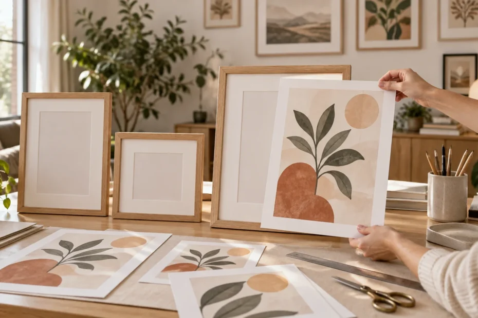
A single finished area has more impact than six partly adjusted surfaces. Rotate framed art, simplify a mantel, regroup family photographs, or style one bookcase. On shelves, vary the shapes and heights while leaving some breathing room around the objects. Personal items work especially well because they make the display look collected rather than copied; these shelf styling ideas for adding personality offer a useful starting point.

Use leftover paint for a small, visible update

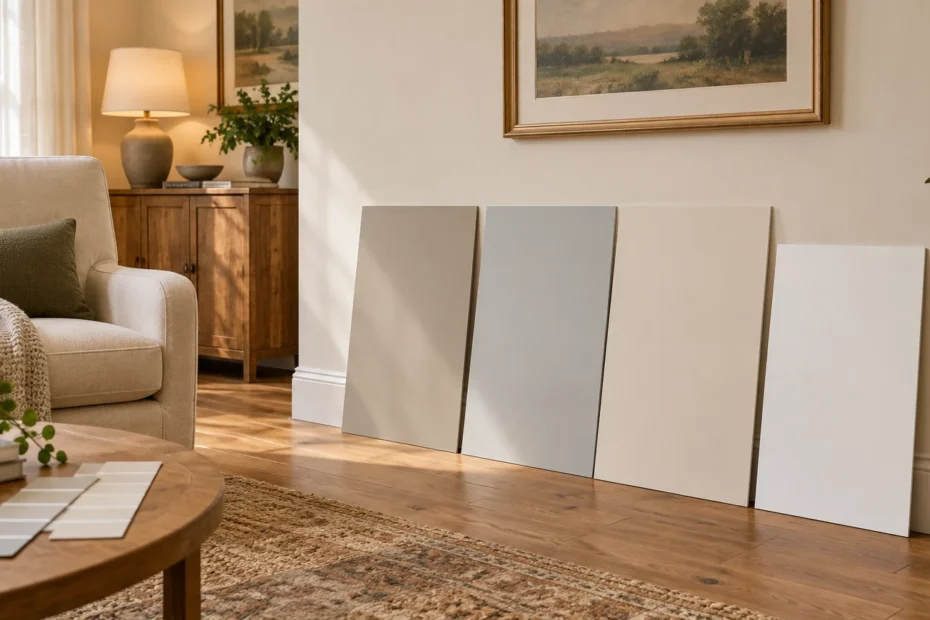
Leftover paint can support a modest project instead of a full-room makeover. PaintCare suggests using remaining paint for small projects, with possibilities ranging from an accent area to smaller details such as a window frame or the inside of a bookshelf. Other contained options include a tray, unfinished frame grouping, or the back panel of a compatible bookcase.

Check the condition of the paint and confirm that it suits the surface, existing finish, and preparation method. Previously finished or laminated furniture may require cleaning, sanding, priming, or a different product, so follow the relevant paint manufacturer’s directions rather than assuming leftover wall paint will adhere.

Label the remaining container with the room, surface, and project information. PaintCare also recommends keeping stored paint dry and protected from freezing. That small habit makes the next repair or refresh much easier.

Organize seasonal decor without creating more clutter

Do not bring the incoming season’s decor into the room until the outgoing pieces are packed. Mixing both sets is how a simple rotation becomes permanent visual clutter.

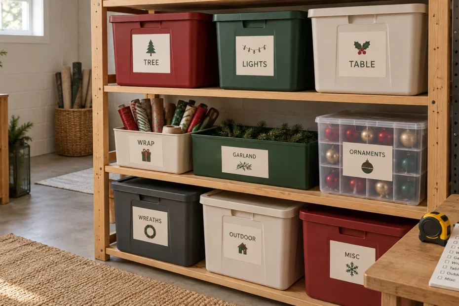
Use one container per room or purpose, such as “living room winter textiles” or “summer entryway.” Specific labels are more helpful than a row of boxes marked “decor.” Handwritten labels are perfectly adequate; if you want a consistent set for visible bins, you can create custom storage labels through a custom sticker printer. Keep a short inventory on the outside so you can decide what to retrieve without opening every container.

Limit each room to the storage space you have assigned. If the bin no longer closes, edit the collection instead of adding another container by default. Seasonal storage should make the home easier to manage, not preserve every object indefinitely.

Be careful with wall and mirror stickers

Decorative stickers can create a personalized focal point, but “removable without residue” is not the same promise as renter-safe or temporary on every painted surface. The supplied CustomStickers product information describes its home-decor stickers as laminated vinyl with permanent adhesive, even though it also states that they can be removed without sticky residue on most surfaces.

Treat that type of product as a longer-lasting accent, not a guaranteed short-term wall treatment. Verify the current product directions, test an inconspicuous area, and consider the age and condition of the paint. For a brief seasonal display, framed paper art, a tabletop sign, or decor hung from existing hardware may be the lower-risk choice.

A five-item seasonal reset checklist

  1. Name the room’s main job for the coming season.
  2. Remove outgoing decor and clear one problem surface.
  3. Test one layout or furniture-zone improvement without blocking doors, drawers, or daily routes.
  4. Improve one lighting layer and add one limited color or texture story.
  5. Finish one focal point, label what goes into storage, and stop before the room becomes overfilled.

Reset the room you already have

A good seasonal refresh should make the room feel more useful before it makes the room look more decorated. Start with the job, clear what is no longer helping, and make one measured functional change. Then add one visual layer that signals the season without taking over the space.

For an immediate win, choose the room you use most, set a two-hour timer, and complete the five-item checklist. The goal is not a brand-new room. It is a calmer, more intentional version of the room you already own.

References

  1. CPSC Adopts Final Consumer Product Safety Standard to Prevent Tip-overs of Dressers and Other Clothing Storage Units | CPSC.gov
  2. www.cpsc.gov
  3. www.cpsc.gov
  4. Strategy Guideline: High Performance Residential Lighting
  5. Use It Up | PaintCare tips for using up leftover paint
  6. Store Right | PaintCare storage tips for leftover paint
  7. Custom Wall and Mirror Stickers | Decorative Stickers – CustomStickers.com

What Size Rug Makes a Small Room Feel Larger?

TLDR: The best rug size for small room layouts is usually the largest standard size that anchors the intended furniture group without blocking doors, vents, chair movement, or walking paths. Do not choose from the room dimensions alone. Measure the furniture zone, compare likely rug sizes, and outline the leading option with painter’s tape before ordering.

A small room does not automatically need a tiny rug. In fact, a rug that floats beneath only the coffee table can break the floor into little visual islands and make the room feel more cramped. A larger rug often creates a calmer result because the furniture reads as one connected arrangement rather than several unrelated pieces.

The goal is not to cover as much floor as possible. It is to find a footprint that looks intentional and still works with the realities of the room: a door that swings inward, a chair that needs to pull back, or a narrow route between the sofa and the wall.

The best rug size for a small room starts with the furniture

Measure the zone you want the rug to define, not just the wall-to-wall dimensions. Rugs can visually organize a seating area, dining nook, bedside zone, or work area by connecting the furnishings associated with that activity. Manufacturer guidance also treats area rugs as tools for defining furniture groupings and activity areas.

Before looking at colors or patterns, make a quick floor plan showing the furniture, doors, vents, hearths, and main walking routes. Then assess each potential rug using three checks:

  • Furniture connection: The rug should visibly relate to the main pieces in the zone instead of floating by itself.
  • Deliberate floor border: The exposed floor should look even and intentional where the room allows it.
  • Clear movement: Doors must open, people must be able to walk comfortably, and dining chairs must remain usable.

Mohawk Home suggests roughly 12 to 18 inches of exposed floor around a living-room rug, while designers cited by Architectural Digest offer broader starting ranges in some situations. These are decorating guidelines, not building rules. A narrow apartment or an off-center architectural feature may call for less floor on one side. Prioritize a balanced furniture arrangement and safe circulation over hitting one perfect number.

Small-room rug sizes to test first

The following dimensions are practical starting points, not universal prescriptions. Actual fit depends on the furniture footprint and fixed obstacles. Tape the proposed outline at full size before treating any option as settled.

Room or zone Sizes worth testing What a successful fit looks like
Compact living room 5 by 7 or 5 by 8 feet; 6 by 9 feet The rug connects the sofa and nearby chairs without interfering with circulation.
Larger small living room 6 by 9 feet; possibly 8 by 10 feet At least the front legs of the main seating can rest on the rug in a consistent arrangement.
Studio seating zone 5 by 7 or 6 by 9 feet The rug defines the living area without spilling awkwardly into the sleeping or kitchen path.
Small bedroom 6 by 9 or 8 by 10 feet; alternatively two runners There is comfortable rug exposure where your feet land, with no conflict at the doorway.
Dining nook Based on table and pulled-out chairs All chair legs remain supported during normal use.
Home office Chair-zone rug sized to the desk layout The chair can move without repeatedly catching an edge.
Entry or narrow passage Runner sized to the clear floor area Doors open freely and the rug does not pinch the walking route.

Ruggable presents 5-by-7 rugs as one possible option for small living rooms and 6-by-9 rugs for compact living rooms, but furniture placement remains the meaningful test. A room label on a product page cannot account for your sofa depth, chair angle, or doorway.

Choosing between 4 by 6, 5 by 7, and 6 by 9

A 4-by-6 rug is best for a deliberately small zone

A 4-by-6 rug can work beside a bed, beneath a compact desk, in an entry, or under a small reading chair and side table. It is harder to use successfully as the main rug in a living room because it often accommodates only the coffee table. That creates the disconnected, postage-stamp effect that makes a room look busy.

If 4 by 6 is the only size that fits without blocking a door or route, treat it as an accent rug for one defined activity. Do not try to make it visually anchor an entire seating group that extends several feet beyond it.

A 5-by-7 or 5-by-8 rug suits a compact arrangement

This range can work when a small sofa faces a media unit and there are no bulky armchairs competing for rug space. Aim for a consistent furniture relationship. For example, place the sofa’s front legs on the rug and keep other seating either similarly connected or clearly outside it.

A 6-by-9 rug often creates a more unified room

The extra width and length can bring the front legs of a sofa and one or two chairs onto the same visual field. Both front-legs-on and intentionally all-legs-off layouts can work; the problem is usually accidental placement, such as one chair balancing halfway on an edge while another floats far away.

An 8-by-10 rug can work in a small room

Do not reject an 8-by-10 rug just because the room is described as small. Tape it out. If it accommodates the complete seating group, preserves usable paths, and leaves a deliberate border of flooring, it may make the room feel simpler than a smaller rug. It becomes too large when edges run awkwardly into thresholds, prevent doors from opening, or disappear under unrelated furniture on the far side of the room.

Use the furniture-leg rule consistently

There are three common seating layouts: all furniture legs on the rug, only the front legs on it, or all legs intentionally off it. In a small living room, the front-legs-on approach is often the easiest balance between visual connection and rug cost.

Whichever layout you select, repeat it around the group as much as the furniture permits. The rug should look like a platform for the arrangement, not an obstacle that the furnishings happened to land on.

  • Place both front sofa legs on the rug rather than one on and one off.
  • Give paired chairs the same relationship to the rug whenever possible.
  • Keep a coffee table fully on the rug instead of straddling an edge.
  • Avoid positioning a rug edge directly where feet naturally pivot when someone stands up.

Rug sizing in a small bedroom

A bedroom rug does not need to reach the headboard to be useful. Placing it beneath the lower portion of the bed can provide softness along the sides and at the foot without crowding the top of the room. Mohawk Home includes lower-bed placement among its suggested bedroom arrangements.

For a queen bed, which has a nominal mattress footprint of 60 by 80 inches, orientation matters. A 6-by-9-foot rug rotated so its 9-foot side crosses the bed is 108 inches wide. Centered beneath a 60-inch-wide mattress, that leaves about 24 inches of rug on each side: (108 − 60) ÷ 2 = 24. Its 6-foot dimension can then sit under the lower section of the bed rather than extending to the headboard.

An 8-by-10 rug gives more coverage and may accommodate nightstands, depending on its placement, but it can overwhelm a tight doorway or cover nearly all the visible floor. If neither size fits the room or budget, place matching runners along the accessible sides of the bed. This gives you the practical benefit where your feet land without paying for rug area hidden beneath the bed.

Dining nooks need a different calculation

A dining rug must be sized for moving chairs, not merely for the tabletop. A rug that looks generous when the chairs are tucked in may become irritating at the first meal if the rear chair legs fall off the edge and catch when pushed forward.

Measure the table and chairs as one active footprint. Pull every chair back to the position a person would use to sit down, then measure the resulting width and length. Mohawk Home specifically advises measuring dining chairs in their pulled-out position, while Ruggable similarly recommends extending the rug beyond the table to accommodate chairs.

A taped outline is more reliable than applying one universal extension to every dining set. Chair depth, table shape, and how far people pull chairs back all vary. If the necessary rug would block a nearby door or kitchen walkway, skipping the dining rug may be better than choosing one that is too small to function.

The 10-minute painter’s-tape test

Painter’s tape or string lets you see the proposed scale before committing to a rug, an approach also recommended in the Architectural Digest rug-sizing guide. The test is especially valuable when you are choosing between two standard sizes.

  1. Measure the furniture zone and note the dimensions of each likely rug.
  2. Mark fixed constraints, including door swings, floor vents, hearths, and narrow passages.
  3. Tape the full outside edge of the first rug size on the floor.
  4. Move the furniture into its intended relationship with the outline.
  5. Open every nearby door and walk each normal route through the room.
  6. For a dining area, pull every chair out and push it back in several times.
  7. Stand in the doorway and take a photograph. A photo often makes an undersized or crooked footprint easier to spot.
  8. Repeat with the next standard size and compare the photographs.

Leave the tape in place for an evening if the choice is close. Normal movement through the room will reveal problems that are easy to miss while concentrating on measurements.

Common rug-sizing mistakes in small rooms

  • Buying by room label: A “small living room rug” may not fit your particular furniture grouping.
  • Sizing only for the coffee table: This can leave the rug visually detached from every substantial piece of furniture.
  • Forcing a tiny floor border: A larger rug is not helpful if it jams against walls, thresholds, or vents.
  • Ignoring door clearance: Check both the door swing and the rug’s actual thickness before buying.
  • Using dining-table dimensions alone: Pulled-out chairs create a much larger functional footprint.
  • Choosing an awkward custom compromise: The largest practical standard size may look more intentional and cost less than an unusual dimension.
  • Assuming every furniture leg must fit: A consistent front-legs-on layout can be entirely deliberate.

What to do when the ideal rug exceeds the budget

First, compare nearby standard dimensions instead of shrinking immediately to the cheapest rug. A plain 6-by-9 rug that connects the furniture will often do more for the room than a highly detailed 4-by-6 rug stranded in the middle.

You can also reduce the area the rug is being asked to serve. Use runners beside a bed, define only a reading corner, or move an occasional chair outside the primary seating group. What matters is that the smaller rug has a clear job. A deliberately defined mini-zone looks thoughtful; an undersized imitation of a whole-room rug does not.

Make the final decision on the floor

For a small room, choose the largest practical rug that unifies the intended furniture zone while preserving movement. Before buying, confirm that the rug connects the main pieces, leaves a deliberate floor border where feasible, clears doors and vents, supports pulled-out dining chairs when relevant, and has been tested with a full-size taped outline.

If you are stuck between two sizes, tape both. The better choice is not automatically the smaller or cheaper one. It is the footprint that makes the furniture look connected and lets the room work normally. That one measured decision can make a compact space feel calmer, larger, and much more finished.

References

  1. Finding the Right Size Area Rug | Mohawk Home
  2. Area Rug Selection by Room | Mohawk Home
  3. Rug Sizes: How to Figure Out the Best Area Rug for Your Space | Architectural Digest
  4. Ruggable Rugs Size Guide: Find the Perfect Fit for Your Home | Ruggable US
  5. Get the right size for your space – Shaw Floors | Costco
  6. Dining Table Rug Size Guide: What Size Rug Do You Need? | Ruggable US

How to Style Open Shelves Without Making Them Look Cluttered

TLDR: The simplest answer to how to style open shelves is to treat each shelf as a series of small, edited groups. Begin with the objects you genuinely use or love, place the largest pieces first, repeat a few colors or materials, and leave deliberate gaps between groups. If the arrangement still feels busy, remove the smallest or least meaningful item rather than buying another container.

Open shelves tend to look cluttered when every object competes for attention. They look intentional when a few objects lead, smaller pieces support them, and the eye has somewhere to rest. You do not need matching décor, a shelf full of beige pottery, or a shopping trip. Books, framed art, useful bowls, plants, boxes, and personal collections can all work when their placement creates a clear rhythm.

How to style open shelves using five visual tools

Before moving anything, look at the entire shelving unit rather than one shelf at a time. You are creating one composition across several horizontal surfaces. A tall vase on the upper left can balance a stack of books on the lower right, while a repeated wood tone or color can connect objects that do not match.

Recent design guidance consistently emphasizes editing open storage, varying the size and height of objects, using containers for small necessities, and mixing useful pieces with decorative ones. These are flexible design tools, not mathematical rules for how many objects every shelf must contain. For additional examples of professionally curated arrangements, see these open-shelving tips from designers.

  • Grouping: Arrange related objects as a small scene instead of scattering individual pieces evenly along the shelf. A short stack of books, a bowl, and a framed photo can read as one group.
  • Negative space: Leave visible shelf surface around or between groups. Empty space is part of the arrangement, not evidence that you have failed to finish it.
  • Scale: Mix large, medium, and small forms. One substantial vase usually creates a stronger starting point than several tiny accessories.
  • Repetition: Repeat a color, shape, finish, or material in different parts of the unit. Three separate touches of black, for example, can connect a frame, a book spine, and a small vessel.
  • Color control: You do not need a strict palette, but it helps to choose a dominant neutral or material plus a couple of recurring accent colors. Turn especially loud book spines inward only if you are willing to sacrifice easy identification; otherwise, relocate a few visually distracting books or break them into smaller stacks.

Start with function, not decoration

The best-looking shelves in real homes still have a job. Kitchen shelves hold dishes. Living-room shelves hold books and family objects. An entry shelf may need a basket for gloves or dog-walking supplies. Trying to hide every practical object can make a room feel staged, while displaying every practical object creates noise.

Empty the shelves if you can, then sort their contents into four loose categories: everyday-use items, decorative pieces, meaningful objects, and things that should live elsewhere. Everyday items deserve the easiest reach. Decorative and meaningful pieces can occupy the less convenient areas. Anything unrelated, duplicated, broken, or permanently ignored should not automatically return.

Containers are most useful when they quiet a collection of unattractive small items. Choose a basket, lidded box, file box, or opaque bin that fits comfortably on the shelf without scraping the shelf above. One appropriately sized container will usually look calmer than several little catchalls. Expert guidance similarly recommends using containers to manage small objects in open storage.

A step-by-step shelf styling method

  1. Choose a visual thread. Identify one or two colors or materials already present in the room, such as warm wood, white ceramic, black metal, blue, or brass. You are looking for repetition, not a perfectly matched set.
  2. Place the largest anchors. Start with framed art, substantial vessels, baskets, plants, or groups of large books. Distribute them across the shelving unit rather than putting every heavy-looking piece on the same side.
  3. Build smaller groups. Add one or two supporting objects near selected anchors. Try a vertical item beside a horizontal stack, or a rounded bowl next to a rectangular frame.
  4. Vary the silhouettes. Mix tall with low, solid with airy, and curved with straight. Avoid lining up five similarly sized objects as though they are waiting at a bus stop.
  5. Preserve useful access. Keep frequently used dishes, books, and supplies easy to lift without moving three decorative objects first.
  6. Step across the room. Shelf arrangements often look balanced up close but crowded from the doorway. Look for dark or busy patches and notice whether all the tall pieces have drifted to one side.
  7. Remove one thing from the busiest area. This final edit is often more effective than rearranging the entire display. Stop before every gap has been filled.

Do not worry about giving every shelf the same number of objects. Visual weight matters more than item count. A large dark planter can carry as much visual weight as a stack of books, a candle, and a small frame. Aim for balance across the full unit, not symmetry on every board.

What to change when the shelves still look wrong

Problem Likely cause Practical fix
The shelves look cluttered Too many small, unrelated objects or no clear gaps Remove several small pieces, combine necessities in one container, and widen the space between groups.
The display looks too empty Everything is small or pushed far apart Add one larger anchor, enlarge a book stack, or lean a framed print behind a smaller object.
The shelves look flat Most objects have the same height and shape Introduce one tall vertical piece, one low horizontal stack, and a rounded form.
The arrangement looks overly matched Colors, containers, and objects repeat too literally Keep the palette but vary age, texture, shape, and material. Add one personal object that breaks the set.
The shelves are attractive but impractical Décor blocks frequently used items Move decorative pieces higher and give everyday items clear, reachable zones.
One side feels heavy Large, dark, or visually dense pieces are concentrated together Move one substantial object to the opposite side or lower shelf and reassess from the doorway.

A worked example for three living-room shelves

Imagine three open shelves holding books, a small framed print, a plant, two ceramic vessels, a family keepsake, and a box of remote controls and charging cables.

On the top shelf, lean the framed print slightly off-center and place the smaller ceramic vessel in front of one lower corner. Leave the other side mostly open. That blank area gives the artwork enough importance to act as the upper anchor.

On the middle shelf, place several upright books toward one side and use a sturdy object as a bookend. Add the plant on the other side, allowing space between the books and foliage. If you want to display a small character or collectible, make it part of the book group rather than leaving it isolated in the middle. Our guide to adding mini-figures to home displays offers more ideas for incorporating tiny personal objects without letting them dominate the shelf.

On the bottom shelf, create a horizontal book stack with the family keepsake on top. Put the second ceramic vessel or the closed utility box toward the opposite side. The box keeps cables and remotes nearby without requiring them to become part of the visual composition.

Notice that the three shelves are not identical. The frame gives the top shelf height, the plant gives the middle movement, and the box gives the bottom shelf visual weight. Repeated book colors, ceramics, or wood tones make the separate arrangements feel related.

Adjust the method for different rooms

Shallow floating shelves

Shallow shelves work best with slim objects: small frames, paperback books, low vessels, and lightweight decorative pieces. Leaning art can add height without consuming much depth, but it should be stable and should not project into a busy walkway. Avoid forcing a basket or planter onto a shelf when its base does not sit fully and securely on the surface.

Kitchen open shelving

Let frequently used dishes do most of the decorating. Stacks of bowls, rows of glasses, mugs, and serving boards already create repetition. Keep everyday pieces within easy reach and reserve higher shelves for occasional serving ware or purely decorative objects. A small plant or framed print can soften the utility, but it should not make unloading the dishwasher harder.

Pantries, entryways, and craft spaces

Organization-heavy shelves need stronger categories and fewer decorative interruptions. Use similar containers where visual calm matters, then label only the items that are genuinely difficult to identify. In these spaces, custom labels or decorative stickers can add a personal visual detail to boxes or bins, but choose and apply any product according to its current material and surface instructions.

Keep labels short and consistent. A pantry does not need a label on a transparent jar of pasta, but opaque bins for baking supplies, party decorations, or craft scraps benefit from clear names. The objective is faster retrieval, not covering every container with another layer of visual information.

Decorate open shelves on a small budget

Shop your own rooms first. Move a framed photo from a crowded console, gather attractive hardback books, or repurpose a small bowl as a catchall. Removing dust jackets can reveal calmer book covers, although there is no reason to alter books you value as collectibles. A clipping in a simple frame, a branch in a bottle, or a child’s small piece of pottery can provide more personality than generic shelf décor.

If you do buy something, fill a specific gap. Purchase a large basket because you need concealed storage, not because an empty shelf made you nervous. Buy a frame for an artwork you already own rather than accumulating another tiny ornament. Open shelving usually improves through editing and redistribution before it improves through shopping.

Do not overlook shelf safety

Styling advice cannot determine whether a shelf is securely installed. Follow the instructions supplied with the actual shelf, including guidance about suitable fasteners, wall material, and load limits. IKEA’s wall-shelf instructions, for example, note that wall materials require different fasteners and that suitable hardware must be chosen for the wall. Decorative arrangements should remain within the manufacturer’s stated limits.

Freestanding bookcases and applicable shelving furniture may also need anchoring, especially in homes with children. The U.S. Consumer Product Safety Commission’s childproofing guidance advises securing furniture such as bookcases and shelves to help prevent tip-overs. Anchoring is a separate task from making the shelves look balanced, but it matters much more.

The easiest next step

Take a photo of your shelves from across the room, then identify the busiest section. Remove three unnecessary objects from that area. Return the largest pieces first, create two or three small groups, and leave at least one obvious gap where the eye can rest.

Live with the arrangement for a day before filling anything else. If the shelves hold what you need, reflect something personal, and do not make the room feel noisier, they are finished. Open shelves should look collected and useful—not packed, perfect, or frozen in place.

References

  1. How to use open storage without adding to clutter – The Washington Post
  2. 8 Ways to Tastefully Curate Your Open Shelving Like a Designer, According to the Pros Themselves
  3. Advice and Instructions
  4. Childproofing Your Home – Several Safety Devices to Help Protect Your Children from Home Hazards | CPSC.gov

How to Refresh a Bathroom Without Starting a Renovation

TLDR

For a convincing bathroom makeover without renovation, concentrate on what you see and touch every day: the shower curtain, bath mat, towels, counter, storage, paint, and small hardware. Fix moisture or maintenance problems first, choose one clear color direction, and update the largest visual elements before buying accessories. The room should end up calmer and easier to use—not simply fuller of new things.

A dated bathroom rarely needs every finish disguised. It usually needs less visual noise, one stronger focal point, and better places for daily necessities. That is good news: you can create a substantial change without moving plumbing, replacing tile, or opening a wall.

Start by separating decorating from maintenance

A cosmetic refresh is appropriate when the bathroom is functional and its surfaces are sound. Pause the project if you find an active leak, soft or swollen material, recurring mold, peeling caused by persistent dampness, or a ventilation problem. The EPA advises fixing moisture problems, drying affected materials, and avoiding paint or caulk over moldy surfaces. It also recommends using an exhaust fan or opening a window while showering to help control moisture. Its guide to mold and household moisture is a useful starting point when you are unsure whether a stain is merely cosmetic.

This checkpoint is not the glamorous part of a makeover, but it protects everything that follows. Fresh paint and attractive baskets cannot solve damp drywall or a leaking supply connection.

Audit the room before shopping

Clear ten minutes and look at the bathroom as though you were entering it for the first time. Take a quick photo from the doorway; visual clutter is often easier to spot in a photograph than while standing in the room.

  • Identify the largest tired-looking element: often the shower curtain, wall color, vanity surface, mirror area, or floor.
  • Notice what is creating visual noise, including half-used bottles, exposed backup supplies, mismatched containers, and too many small decorations.
  • Write down where the routine breaks: towels land on the floor, skin-care products crowd the sink, or cleaning supplies topple under the vanity.
  • Choose one existing feature worth keeping and coordinating with, such as warm beige tile, a chrome faucet, a wood vanity, or retro pink fixtures.
  • Measure available wall, drawer, cabinet, and under-sink space before buying storage. Account for pipes, outlets, doors, and anything that must remain accessible.

Now pick a restrained direction. Warm neutral, cheerful vintage, crisp contrast, or soft spa-like can all work. The label matters less than consistency. Choose two main colors plus one metal or wood tone, then repeat them instead of introducing a new idea with every purchase.

Plan your bathroom makeover without renovation from largest to smallest

The order of work matters. A bold shower curtain can change the room more than six tiny countertop accessories, while removing clutter may improve it more than either. Start with the broad visual field and finish with details.

1. Make the shower curtain the focal point

In a tub-and-shower bathroom, the curtain is often one of the largest uninterrupted surfaces. Choose a solid color, broad stripe, or medium-scale pattern that relates to the tile. Hang it neatly, replace visibly worn rings if needed, and keep the liner on the wet side. If the room already has patterned tile, I would usually choose a quieter curtain rather than make the two patterns compete.

2. Coordinate with dated tile instead of fighting it

Old tile looks most awkward when everything around it belongs to a completely different palette. Study its undertone. Cream or tan tile can feel deliberate beside warm white, olive, rust, or natural wood. Cool gray tile works more comfortably with white, charcoal, muted blue, or cool green. Pink, yellow, and blue vintage tile can become the room’s character when repeated once in a towel stripe, art print, or small tray.

Avoid buying a fully matched bathroom set. Repeating a color two or three times looks coordinated; repeating the same pattern on the curtain, mat, towels, and accessories can make a small room feel busy.

3. Decide whether paint is worth the effort

Paint can reset a bathroom when the walls dominate the view, but use a coating intended for the room’s conditions and follow its preparation, application, drying, and ventilation directions. Benjamin Moore, for example, markets Aura Bath & Spa for high-humidity interiors and describes it as mildew resistant; that is a manufacturer claim about that specific product, not a promise that paint will correct an underlying moisture problem.

Renters should obtain permission before painting. Homeowners should first determine why existing paint is peeling. If you have leftover paint afterward, keep it in its original labeled container and check local disposal options; PaintCare notes that accepted products and drop-off details vary by location.

4. Replace worn textiles as a group

A fresh bath mat and two useful towel colors can connect finishes that otherwise feel unrelated. Prioritize washable textiles that can dry properly in your room. One practical formula is a curtain in the main color, towels in a quieter related shade, and a mat close to the floor or vanity color. The result feels layered without becoming fussy.

Treat organization as part of the makeover

A beautiful bathroom still feels unfinished when the counter cannot support a normal morning. Sort the contents into daily use, weekly use, backup stock, cleaning supplies, guest items, and things that do not belong in the bathroom.

Keep only genuinely daily items on the counter. A small tray can contain soap and two or three routine products, but it should not become a parking lot for every bottle you own. Store weekly products in a drawer or shallow bin, backups together in a cabinet, and cleaning supplies in a safe location appropriate for your household.

  • Use hooks where people tend to drop towels or robes. They are forgiving in a busy family bathroom.
  • Use a towel bar when you have enough uninterrupted wall space and want towels to hang open.
  • Add drawer dividers for small grooming items that otherwise migrate across the vanity.
  • Choose handled bins for deep cabinets so items at the back remain reachable.
  • Fit under-sink storage around the actual plumbing rather than buying a large organizer and hoping it works.
  • Keep open baskets limited to attractive or frequently used items; hidden storage is better for colorful backup packaging.

Adhesive hooks and caddies can be useful where drilling is not permitted, but “removable” does not mean universally suitable. Product lines differ in compatible surfaces, moisture resistance, installation steps, cure time, and weight limits. Check the exact instructions before installation and loading. Command’s bathroom guidance specifically directs users to product-level surface and weight information and includes cautions for certain surfaces. If you are also considering labels or decorative decals, this guide to permanent versus removable sticker adhesive explains why surface and removal needs matter.

Choose small details that earn their space

Once the large surfaces and storage are settled, add one or two finishing moves. Frame appropriately placed art, restyle the mirror area, add a compact washable tray, or swap cabinet knobs if the change is permitted and reversible. Keep the original hardware in a labeled bag so it can be reinstalled later.

Decorative labels can make matching bins easier to identify, but use materials suitable for the intended surface and room conditions. Avoid covering required product information, vents, controls, grout that must breathe or dry, and areas exposed to direct water unless the product specifically supports that use.

Be cautious with generic peel-and-stick wall coverings or decorative tile sheets. Bathrooms combine humidity, cleaning products, and splash zones, and suitability varies by product and surface. Only install one when its manufacturer explicitly permits that environment and placement. A shower curtain, paint on an appropriate sound wall, or framed art outside a splash zone is often the lower-risk decorating move.

Compare the highest-impact updates

The impact descriptions below are editorial judgments, not tested performance ratings. Renter-friendliness also depends on the lease, installation method, and landlord approval.

Update Likely benefit Renter-friendly? Main watch-out
Edit the counter and cabinets High visual and functional impact Yes Do not buy organizers until you measure
Change the shower curtain and bath mat High visual impact Usually Choose washable materials suited to bathroom use
Add hooks, bins, or drawer dividers High functional impact Often Verify mounting surface and load instructions
Paint sound walls High visual impact Permission dependent Do not paint over mold or unresolved dampness
Swap cabinet knobs Moderate visual impact Permission dependent Save the originals and match the existing holes
Add art or labels Moderate finishing impact Often Keep materials away from unsuitable wet or humid locations

A realistic weekend refresh for a compact dated bathroom

Imagine a small bathroom with beige tile, a brown vanity, chrome fixtures, and almost no closed storage. Instead of trying to disguise all four, make the beige and brown feel intentional.

  1. Check for leaks, damaged caulk, damp surfaces, or ventilation concerns before decorating.
  2. Empty the counter, vanity, and shower ledges. Discard or relocate what does not belong.
  3. Clean the room thoroughly, including the mirror, fixtures, cabinet fronts, and washable textiles.
  4. Choose warm white as the main color, muted olive as the accent, and keep the existing chrome consistent.
  5. Hang a warm-white shower curtain with a subtle olive stripe or border.
  6. Add solid olive or cream towels and a simple mat that does not compete with the tile.
  7. Place daily products on one compact tray. Move weekly products into a measured drawer divider.
  8. Add an appropriately mounted towel hook only if the selected product is approved for the surface and expected load.
  9. Finish with one small art piece outside the splash zone rather than several tiny decorations.

This plan does not pretend the tile is new. It edits the room until the existing finishes look like part of a palette rather than unrelated leftovers. Just as importantly, it improves where towels and products go.

Common mistakes that make a refresh feel unfinished

  • Shopping before decluttering, which creates new storage for things you may not need.
  • Trying to hide every dated feature instead of choosing one to work with.
  • Using too many small accessories when one strong curtain or paint color would have more impact.
  • Assuming any adhesive product will work on tile, painted walls, or humid surfaces.
  • Putting paper prints, untreated wood, or unapproved adhesive coverings where they receive direct splashes.
  • Mixing several competing metals, patterns, and accent colors in a small room.
  • Decorating over peeling paint, recurring mold, failed caulk, or water damage.

Make the room calmer before making it newer

The best no-reno bathroom refresh changes the room’s hierarchy: fewer bottles catch your eye, the curtain becomes a deliberate focal point, textiles connect the existing finishes, and everyday items finally have sensible homes.

Start today by clearing the counter and taking one doorway photo. Then choose the single largest visual change and the single storage problem that causes the most daily friction. Solve those two things first. That is usually enough to make a bathroom feel intentional without allowing a decorating project to turn into a renovation.

References

  1. A Brief Guide to Mold, Moisture and Your Home | US EPA
  2. Aura® Bath & Spa Waterborne Interior Paint – Matte Gallon Lampblack CW-695 | Benjamin Moore
  3. Get the Answers to PaintCare's Frequently Asked Questions
  4. How to use Command™ Bathroom Solutions
  5. Have questions? Check out Command™ FAQs | Command™ Brand

How to Make QR Code Stickers That Actually Scan

TLDR

  • Use a short, stable destination URL before generating the QR code.
  • Keep strong contrast between the code and its background.
  • Preserve the blank quiet zone around all four sides.
  • There is no universal minimum size for every QR code. Data density, printing, and scanning distance matter.
  • Flat surfaces are usually easier to scan than sharply curved ones.
  • Print and test a physical sample before producing a large sticker run.
  • Put a clear call to action beside the QR code so people know why they should scan it.

QR code stickers have one job that matters more than anything else.

They need to scan.

A beautifully branded code that requires someone to stand under exactly the right light while moving their phone back and forth for 20 seconds has failed.

Fortunately, most QR code sticker problems are preventable.

The design needs enough contrast, enough room around the code, a sensible physical size, and a destination worth visiting.

Start With the Destination

Do this before worrying about sticker shape or color.

Where should the QR code go?

Possibilities include:

  • a product page
  • restaurant menu
  • event registration page
  • review page
  • instruction video
  • warranty form
  • contact page
  • social profile
  • promotion

Use a page designed for phones.

Someone scanning a QR code is almost certainly already on a mobile device.

A QR sticker that opens a desktop-only PDF with 8-point text technically works, but it does not create a particularly useful experience.

Keep the URL Simple

The amount of information encoded in a QR code affects its density.

More data can require a larger matrix containing more individual modules.

GS1 specifically notes that QR code size requirements vary with the amount of encoded data, print quality, available space, and scanning environment.

If the purpose is simply to send someone to a webpage, use a clean URL rather than encoding a giant block of text.

A shorter destination also gives you more room to keep the printed modules clear.

Do Not Remove the Quiet Zone

The blank border around a QR code is functional.

It is called the quiet zone.

DENSO WAVE, the company behind the QR Code standard, specifies a clear margin four modules wide around all four sides of a QR code.

Designers often ruin this because the empty area looks available.

So they move a logo closer.

They add decorative dots.

They place the code directly against a photograph.

Leave the space alone.

Sometimes the best design decision is recognizing that the apparently empty space is doing a job.

Contrast Beats Creativity

Black on white is boring.

It also scans extremely well.

You can use other colors, but keep the code dark and the background light enough to provide strong contrast. GS1’s 2D barcode guidance says black and white gives the best contrast and recommends keeping the quiet zone consistent with the barcode background.

Be careful with:

  • pastel-on-pastel combinations
  • busy photographs
  • gradients behind the code
  • highly reflective patterns
  • colors with very similar brightness

You do not need to remove all branding.

Give the QR code its own clean light-colored field and let the surrounding sticker carry the visual style.

Do Not Assume One Minimum Size Works Everywhere

You will see universal rules online such as “never print a QR code smaller than one inch.”

That is easy advice.

It is not a complete technical rule.

QR size depends on:

  • how much data is encoded
  • the number of modules
  • printing resolution
  • surface quality
  • scanning distance
  • expected scanner or phone
  • lighting

GS1 explicitly says there is no single fixed QR-code size because these variables matter.

For a sticker that will be scanned at arm’s length, do not push the size toward the absolute technical limit just because your design software allows it.

Give yourself margin.

Then print it.

Be Careful With Curved Surfaces

A QR code on a flat shipping box has an easy life.

A code wrapped around a narrow bottle does not.

Sharp curvature can distort the square geometry visible to the camera. That gets worse as the QR code becomes large relative to the circumference of the object.

If the sticker is intended for:

  • bottles
  • tubes
  • cups
  • helmets
  • curved equipment

test it on the actual surface.

A smaller QR code may sometimes sit flatter, but making the modules too small creates a different scanning problem.

This is exactly why physical testing matters.

Consider the Sticker Finish

Highly reflective surfaces can create glare in direct light.

That does not mean glossy stickers can never contain QR codes. Millions do.

But if reliable scanning is critical, test the specific combination of print, laminate, lighting, and placement.

Specialty materials deserve even more attention.

A QR code printed directly over a strongly holographic or metallic background may not provide consistent contrast.

One practical solution is a solid white or light-colored area beneath the QR code.

You still get the specialty effect around the design without asking the phone camera to interpret it through every square of the code.

Static vs Dynamic QR Codes

A static QR code stores its destination directly.

If you encode a URL, the code continues pointing to that URL.

The QR pattern itself does not spontaneously expire.

But the webpage can disappear.

A dynamic QR service generally sends the scan through a redirect that lets the owner change the eventual destination later.

That is useful for long-lived stickers.

But it creates another dependency: the redirect service needs to continue operating and your account needs to remain active under whatever terms apply.

For important long-term uses, think about who controls the redirect before printing thousands of pieces.

Tell People Why They Should Scan

Do not assume curiosity will do all the work.

Instead of placing a lonely square beside your logo, add a short instruction:

Scan for installation instructions

Scan to leave a review

Scan for the full menu

Scan to register your product

That tells the customer what happens next.

It also gives you a better reason to include the QR code in the first place.

Test the Physical Sticker

This is the final step.

Not the PDF.

Not the proof on your 27-inch monitor.

The sticker.

Test it:

  • on an iPhone
  • on an Android phone
  • indoors
  • near a window
  • on the intended surface
  • at normal scanning distance
  • at slightly awkward angles

If it is a product label, put it on the product.

If it is a window sticker, test it on glass.

If 10,000 stickers are about to go into production, spending five minutes abusing the prototype is a very good use of time.

FAQs

How Much Blank Space Should Be Around a QR Code?

A standard QR code requires a quiet zone four modules wide on all four sides.

Can a QR Code Be Colored?

Yes, but strong contrast is important. A dark code on a light background is the safer approach.

Can QR Codes Go on Holographic Stickers?

They can, but reflective materials deserve physical testing. A solid light-colored area behind the QR code can provide more consistent contrast.

Do Printed QR Codes Expire?

The printed pattern does not simply expire. A linked destination or third-party redirect service can stop working, however.

Final Thoughts

A QR code does not need to be the prettiest part of a sticker.

It needs to work every time somebody reaches for a phone.

Protect the quiet zone. Use strong contrast. Give it enough physical size. Put it on a sensible surface. Link somewhere useful.

Then print one and scan it.

A working prototype beats a beautiful assumption.

References

  • DENSO WAVE, QR Code symbol area and four-module quiet zone.
  • GS1, QR code sizing guidance.
  • GS1, 2D barcode contrast and quiet-zone guidance.
  • GS1, 2D barcode implementation guidance.

How to Launch a Product With a Small Budget

TLDR

A small-budget product launch should prove demand before it tries to look like a large brand.

  • Test the idea before ordering a large amount of inventory.
  • Launch one clear product or a small, focused collection.
  • Spend first on product quality, packaging essentials, and a reliable sales page.
  • Use standard containers and boxes with custom labels instead of ordering fully custom packaging.
  • Build interest through email, organic social content, local partnerships, samples, and existing customers.
  • Track sales, conversion, feedback, and profit rather than judging the launch by social engagement alone.
  • Keep part of the budget unspent so you can fix problems or reorder what sells.

A product launch can become expensive long before the first customer has a chance to buy anything.

There is always another possible expense: custom packaging, professional video, paid advertising, influencer fees, a large inventory order, a new website, display materials, and launch merchandise. None of those things is automatically a bad investment. But when the budget is limited, every expense needs to help answer a useful question.

Does anyone want this product? Will they pay the planned price? Does the packaging work? Can the business fulfill orders reliably? Which message makes people pay attention?

The goal of a small-budget launch is not to imitate a national brand for one week. It is to bring a solid product to market, learn from real customers, and preserve enough money to continue after launch day.

Decide What the First Launch Needs to Prove

A first launch does not need to prove that the product can become a global business. It needs to prove that a specific group of customers will buy it.

Write down the main assumptions behind the product:

  • Who is most likely to buy it?
  • What problem does it solve?
  • What makes it different from available alternatives?
  • What price seems reasonable?
  • Where will customers discover it?
  • What concerns might stop them from ordering?
  • Will they buy it once or return for more?
  • Can the product be produced and delivered profitably?

The U.S. Small Business Administration recommends evaluating demand, market size, customer location, market saturation, and the prices customers currently pay for alternatives. It also suggests using direct research such as surveys, questionnaires, focus groups, and interviews when a business needs feedback specific to its own audience.

You do not need a large formal study. Ten useful conversations with likely customers can reveal more than 1,000 impressions from people who were never going to buy the product.

Ask concrete questions. “Do you like this?” usually produces polite answers. Better questions include:

  • Which version would you choose?
  • What would stop you from buying this?
  • Where would you expect to find it?
  • What do you currently use instead?
  • What price would make you hesitate?
  • Which feature matters most?
  • What information is missing from the package?

Look for repeated patterns rather than treating every comment as an instruction.

Calculate the Full Launch Cost

Inventory is only one part of a product-launch budget.

The SBA lists equipment, supplies, inventory, marketing, printed materials, websites, licenses, insurance, professional services, and market research among the expenses a new business may need to consider. Calculating those costs before launch makes it easier to estimate profit and determine a break-even point.

Create a simple budget with these categories:

CategoryPossible Expenses
ProductSamples, ingredients, materials, manufacturing and testing
PackagingContainers, boxes, mailers, labels and protective materials
SalesWebsite, marketplace fees, payment processing and photography
MarketingSamples, events, printed materials, creators and advertising
FulfillmentPostage, shipping supplies, software and storage
CompliancePermits, testing, insurance and required product information
ReserveReprints, damaged inventory, replacements and unexpected costs

Do not spend the entire budget before customers respond. A reserve gives you room to fix a label, reorder the best variation, replace damaged packaging, or put more money behind a channel that is already working.

Example $1,000 Launch Budget

This is only an example. The right allocation depends on the product.

ExpenseExample Amount
Product samples and first inventory$400
Containers and packaging$150
Labels and printed materials$100
Product photography setup$50
Website or marketplace costs$75
Samples and local promotion$100
Emergency and reorder reserve$125

A food, cosmetic, electronic, or children’s product may need a much larger compliance and testing budget. Do not reduce required safety work to protect the marketing budget.

Launch the Smallest Version That Still Feels Complete

A narrow product line is easier and less expensive to explain, photograph, stock, package, and fulfill.

Instead of launching:

  • Twelve scents
  • Eight colors
  • Six sizes
  • Four package styles
  • Three subscription plans

Start with the strongest version or a carefully chosen group of options.

This does not mean releasing an unfinished product. The item still needs to work properly, look intentional, and include everything the customer reasonably expects.

A small launch might include:

  • One core product
  • One standard size
  • Two or three popular variations
  • One bundle
  • One clear package format

Every additional variation creates another inventory decision. It also divides early sales data. If you sell three units of eight different colors, it is harder to know whether the product is weak or the inventory is simply too scattered.

Start focused. Expand after actual orders show what customers want.

Use Preorders Carefully

Preorders can reduce the amount of inventory needed before launch. They can also create problems when production dates are uncertain.

A preorder works best when:

  • A working sample already exists.
  • The manufacturer has confirmed capacity.
  • The delivery estimate includes a reasonable buffer.
  • Customers clearly understand that the product is not ready to ship.
  • The refund and cancellation policy is easy to find.
  • The business can communicate delays quickly.

Do not use preorder money to discover whether the product can be manufactured at all. Customers are helping fund a production run, not volunteering for an open-ended experiment.

Another option is a waitlist. A waitlist measures interest without collecting payment. It does not prove demand as strongly as an order, but it can help compare product variations and estimate the size of an initial production run.

Build One Clear Product Offer

A launch becomes harder when customers cannot quickly understand what they are buying.

The product page and launch message should answer:

  • What is it?
  • Who is it for?
  • What does it do?
  • What is included?
  • What makes it different?
  • How much does it cost?
  • When will it ship?
  • What happens if there is a problem?

Try to explain the product in one sentence:

A compact weekly meal planner for families who want to organize dinners without managing another app.

Or:

A reusable glass spray bottle with concentrated cleaning tablets that reduce the need to store several plastic bottles.

That sentence does not need to be clever. It needs to help the right customer recognize the product.

Avoid building the launch around broad claims such as “better quality,” “life-changing,” or “the next big thing.” Specific benefits are easier to trust.

Create a Small Brand System

A new product does not need a fifty-page brand manual.

It does need consistency.

Choose:

  • One primary logo
  • One simplified logo or icon
  • Two typefaces at most
  • A small color palette
  • One photography direction
  • A consistent writing style
  • A simple label layout

Use the same system across the product page, labels, social posts, order inserts, and event materials.

A simple design repeated consistently usually looks more established than several complicated designs that do not match.

Make sure the brand name and product name remain readable at the actual package size. A label displayed at 800 pixels wide on a computer can hide problems that become obvious when it is printed at two inches.

Make Standard Packaging Feel Custom

Fully custom boxes, bags, bottles, and molded containers often require larger quantities than a small launch can justify.

Start with reliable stock packaging and customize the visible parts.

A plain jar, pouch, mailer, or folding box can look like a finished product when it has:

  • A properly sized product label
  • A consistent color system
  • A clean package seal
  • A short product insert
  • A branded shipping sticker
  • Clear instructions
  • Accurate product information

CustomStickers.com offers printed labels for bottles, jars, boxes, and bags in custom shapes and quantities. The ordering process includes an artwork proof, which lets a small business review the proposed printing and cut before production.

The label should fit the packaging rather than simply fitting the logo. Test it on the real container and check:

  • Readability
  • Color
  • Placement
  • Curvature
  • Adhesion
  • Moisture exposure
  • Opening and closing
  • Required information

A label that crosses a seam, wrinkles around a shoulder, or blocks the package opening will not feel polished regardless of the artwork.

Order Small Quantities Before Buying in Bulk

Lower unit costs are attractive, but only when the product, design, and size are already correct.

A large order of the wrong label is not a bargain.

Use a small first run to test:

  • Product demand
  • Label size
  • Package fit
  • Color accuracy
  • Customer preferences
  • Shipping durability
  • Application time
  • Reorder frequency

For an early launch or prototype package, low-quantity die-cut stickers with no minimum can help a business test a logo, package seal, or giveaway before moving to a larger order. CustomStickers.com states that this product can be ordered in quantities ranging from a single sticker to bulk runs.

Once the product is stable and repeat orders become predictable, larger quantities may reduce the unit cost.

Use Stickers as Flexible Launch Materials

A branded sticker can serve several purposes during a small launch.

The same basic design might be used as:

  • A customer giveaway
  • A package extra
  • An event handout
  • A shipping-box seal
  • A laptop or water bottle sticker
  • A local retail counter giveaway
  • A reward for joining an email list

Durable custom vinyl brand stickers can keep circulating after the package, flyer, or launch event is over. CustomStickers.com prints these on vinyl with a protective laminate for indoor and outdoor use.

Do not make the design look like a small advertisement unless that is genuinely useful. Customers are more likely to keep a strong illustration, mascot, phrase, or recognizable logo than a sticker crowded with a phone number, URL, social handles, and a paragraph.

For a product collection, multi-design sticker sheets can combine several small designs on one backing sheet. This may work well for launch bundles, artist products, children’s items, journals, stationery, and themed promotional sets. CustomStickers.com allows one repeated design or several different designs to be placed on a sheet.

Each link and product should have a job. Do not buy three types of stickers merely to make the launch table look busy.

Take Useful Product Photos Without a Studio

Customers need to see the product clearly before they can decide whether to buy it.

A basic product-photo setup can use:

  • A smartphone with a good camera
  • Indirect window light
  • White foam board
  • A clean background
  • A small tripod
  • An inexpensive reflector
  • Simple editing software

Capture at least:

  1. A clean front view
  2. The product from another angle
  3. A close-up of important details
  4. The package and everything included
  5. The product in use
  6. An image that shows scale

Photograph the real product. Renderings and mockups can support a listing, but they should not be the only images once finished inventory exists.

Use the same lighting and editing style across the launch. A small set of consistent photos usually looks better than a large gallery collected from several unrelated shoots.

Build One Good Sales Page

A small launch does not require a large website.

One useful product page should include:

  • A clear headline
  • A direct product description
  • Strong photos
  • Price
  • Available variations
  • Dimensions or quantity
  • Materials or ingredients
  • Care instructions
  • Shipping estimate
  • Return or replacement information
  • Frequently asked questions
  • A visible purchase button

Shopify describes a product launch as the process of taking a validated product concept to market through coordinated product, marketing, sales, and operations work. Its launch guidance emphasizes research, planning, and reaching the right audience rather than relying only on launch-day promotion.

Test the full ordering process on a phone. Confirm that the customer can select an option, enter payment information, understand shipping, and receive an order confirmation without confusion.

Build Interest Before Launch Day

Do not wait until the product is available to mention it for the first time.

A simple prelaunch sequence might begin two to four weeks before release:

Early Preview

Show the problem, idea, material, sketch, or prototype.

Development

Share a useful decision, test, failure, or improvement.

Product Reveal

Show what the product is and who it is for.

Details

Explain size, materials, variations, price, and availability.

Reminder

Tell interested customers when and where it will be available.

Launch

Make the product easy to buy.

This sequence does not need daily posting. A few useful updates can create context without exhausting the audience before the product arrives.

Collect email addresses when possible. Social reach changes from post to post, while an email list gives the business a direct way to contact people who asked for updates.

Use Existing Customers First

A business with current customers already has a valuable launch audience.

Reach out to people who:

  • Buy related products
  • Have asked for the new item
  • Frequently reorder
  • Participate in a loyalty program
  • Leave detailed feedback
  • Attend local events
  • Have opted into email marketing

Give them an early look, sample, or limited preorder opportunity.

Do not add people to promotional lists without permission. And avoid making loyal customers feel like unpaid product-development staff. Their feedback is useful, but the final product decisions remain the business’s responsibility.

Work With Small, Relevant Creators

A creator with a smaller but relevant audience can be more useful than a large account whose followers have little interest in the product.

Look for people whose existing content naturally overlaps with:

  • The product category
  • The customer problem
  • The local area
  • The product’s style
  • The activity where the product is used

Before sending samples, agree on what is and is not expected.

A gifted product does not automatically guarantee coverage. Paid content should have clear terms, deadlines, usage rights, and disclosure expectations. Follow applicable advertising and endorsement rules.

Start with a few carefully chosen people. Sending fifty unrequested packages can consume inventory and postage without producing meaningful feedback or sales.

Use Local Partnerships

A local launch can be easier to manage than a broad national campaign.

Potential partners include:

  • Complementary retailers
  • Coffee shops
  • Salons
  • Gyms
  • Studios
  • Farmers markets
  • Community events
  • Professional associations
  • Local creators
  • Subscription boxes

A partnership should make sense for both audiences.

A candle maker might partner with a florist. A local snack brand might work with a coffee shop. A stationery company might create a small event with a bookstore or art studio.

Possible arrangements include:

  • A one-day pop-up
  • A shared giveaway
  • Product samples
  • A small wholesale test
  • A bundle
  • A launch event
  • Counter cards
  • A customer referral exchange

When a launch is strongly location-based, USPS Every Door Direct Mail can distribute qualifying postcards, menus, and flyers to selected local postal routes without requiring a separate list of names and addresses. It is better suited to products with a clear local audience than to a highly specialized product sold nationally.

Keep Paid Advertising Small and Measurable

Paid advertising can be useful, but it should not be the first place an untested product spends most of its budget.

Start with:

  • One audience
  • One offer
  • One product page
  • A small daily limit
  • A defined test period
  • A clear success metric

Do not test five audiences, eight ads, three landing pages, and four offers with a budget too small to produce useful results for any of them.

Track:

  • Cost per visitor
  • Product-page conversion rate
  • Cost per order
  • Average order value
  • Gross profit after ad spend
  • Email signups
  • Repeat purchases

An advertisement that produces inexpensive clicks but no profitable orders is not working.

Plan Launch Week Before It Starts

A basic launch schedule prevents last-minute confusion.

Two Weeks Before

  • Confirm final inventory.
  • Test packaging and shipping.
  • Finish product photos.
  • Complete the sales page.
  • Prepare email and social content.
  • Send approved samples.
  • Confirm event or retail details.

Three Days Before

  • Test checkout again.
  • Verify inventory counts.
  • Prepare packing supplies.
  • Schedule core announcements.
  • Review customer-service answers.
  • Confirm shipping estimates.

Launch Day

  • Publish the product page.
  • Send the main email.
  • Post the clearest product announcement.
  • Respond to questions.
  • Monitor checkout and inventory.
  • Record problems rather than guessing later.

The Following Week

  • Share demonstrations and customer questions.
  • Repost customer content with permission.
  • Clarify common misunderstandings.
  • Follow up with interested customers.
  • Review sales and profit.
  • Decide what needs to change.

A launch is not over after the first announcement. Many customers need to see a product several times or wait until they have a reason to buy it.

Measure the Right Results

Likes, views, and comments can show interest. They do not pay for another production run.

Track:

  • Units sold
  • Revenue
  • Gross profit
  • Conversion rate
  • Average order value
  • Email signup rate
  • Refunds and replacements
  • Customer questions
  • Best-selling variation
  • Inventory remaining
  • Acquisition source
  • Repeat purchase rate

Also record qualitative feedback.

What confused customers? Which benefit did they mention? Did they understand the size? Was the packaging easy to open? Did the item arrive safely?

The first launch should produce information even when sales are modest.

What Not to Overspend On

A small product launch usually does not need:

  • A large custom-packaging order
  • A complicated website
  • A full product line
  • An expensive launch party
  • A broad influencer campaign
  • Several months of inventory
  • Large promotional products
  • Daily paid advertising on every platform
  • Premium software for a simple workflow
  • A complete rebrand before demand is known

Spend on things that protect the product, explain it clearly, and make buying easy.

Delay expenses that mainly make the launch appear larger than it is.

A Lean Product Launch Checklist

Before launching, confirm that:

  • The product has been tested.
  • The target customer is clearly defined.
  • The price covers direct and indirect costs.
  • The first inventory order is manageable.
  • Product information is accurate.
  • Required warnings and disclosures are included.
  • Packaging protects the item.
  • Labels fit and remain readable.
  • Product photos show what customers receive.
  • The sales page works on mobile devices.
  • Shipping rates and timelines are clear.
  • Return and replacement policies are available.
  • Launch content is prepared.
  • Customer questions have an owner.
  • Tracking is set up.
  • Part of the budget remains unspent.

A Small Launch Can Still Be a Strong Launch

A limited budget forces useful decisions.

It encourages a business to test demand, reduce unnecessary variations, use standard packaging intelligently, and focus on the customers most likely to buy.

That is not a weaker version of a product launch. In many cases, it is a more disciplined one.

Start with the smallest complete version of the product. Explain it clearly. Make the package feel intentional. Put it in front of a relevant audience. Then use real sales and customer feedback to decide what deserves the next round of investment.

What to Include in Every Customer Package

TLDR

Every customer package should contain the correct product, enough protection to prevent damage, a short thank-you message, and any instructions the customer needs. Depending on the order, you may also include return information, a branded sticker, a discount, or a QR code.

Keep the package useful and easy to open. A few thoughtful items usually make a better impression than a box filled with promotional clutter.

A customer package has two basic jobs. It needs to deliver the product safely, and it should make the customer feel confident about buying from your business.

Knowing what to include in every customer package helps you create a consistent packing process. It also prevents common problems such as missing instructions, unclear return policies, damaged products, and customers who have no idea how to contact you.

The best packages are not necessarily the most elaborate. A plain mailer with a clear note and a well-protected product can feel far more professional than an expensive box stuffed with shredded paper, coupons, and enough confetti to create a small weather event.

Here is what deserves a place in your customer packages.

Start With the Correct Product

This sounds painfully obvious, but accurate order fulfillment matters more than any decorative packaging detail.

Before sealing the package, confirm:

  • The correct product is included
  • The size, color, style, or variation matches the order
  • The quantity is correct
  • Any personalization is spelled correctly
  • All product parts and accessories are present

Create a simple packing checklist for employees or fulfillment partners. For customized orders, compare the finished product against the approved proof or order details before packing it.

A beautiful thank-you card will not do much to soften the experience of receiving someone else’s order.

Use Enough Protective Packaging

The product should arrive in the same condition it was in when it left your business.

Choose protective materials based on the actual risks involved. A ceramic mug needs cushioning and open space around the product. An art print needs support that prevents bending. Clothing may only need a protective bag or tissue wrap inside the shipping mailer.

Common protective materials include:

  • Bubble wrap
  • Kraft paper
  • Corrugated inserts
  • Cardboard backing
  • Tissue paper
  • Foam sleeves
  • Protective bags
  • Corner protectors
  • Tamper-evident seals

Try not to use an oversized box simply because it is available. Larger packages usually require more filler and may allow the product to shift during shipping.

After packing the item, gently shake the box. If the product moves freely, add support before sealing it.

Add an Order Summary When It Is Useful

A packing slip helps customers confirm what they received. It can also make your own returns and customer service process easier.

A basic packing slip may include:

  • Order number
  • Customer name
  • Product names
  • Quantities
  • Product variations
  • Business name
  • Customer service contact information

You may want to leave prices off packing slips when an order could be a gift. Some businesses provide a checkbox during checkout that allows the buyer to request gift-friendly packaging.

For simple one-item orders, a packing slip may not always be necessary. But it becomes more useful when an order contains several products, custom options, wholesale quantities, or subscription items.

Include a Short Thank-You Message

A thank-you message is one of the easiest ways to make a package feel like it came from a real business rather than a fulfillment machine.

The message does not need to be long. Two or three sentences are usually enough.

For example:

Thank you for supporting our small business. We hope you enjoy your order. Please contact us if you have any questions or need help.

A handwritten note can feel especially personal, but it may not be practical once order volume increases. A printed card with space for a name, initials, or short written message provides a useful middle ground.

Businesses can use custom note cards for thank-you messages, welcome notes, gift enclosures, and branded packaging inserts. Keeping the design simple leaves room for a personal message without making the card feel like an advertisement.

Provide Care or Usage Instructions

Do not assume customers already know how to use, clean, assemble, store, or maintain the product.

Include instructions when incorrect use could damage the item, shorten its lifespan, or create unnecessary frustration.

Care instructions may explain:

  • How to wash or clean the product
  • What temperatures or chemicals to avoid
  • How to apply or install the item
  • How long to wait before using it
  • How to store the product
  • How to charge or operate it
  • How to remove protective films
  • How to recycle or dispose of packaging

Keep the main instructions brief. A small card can cover the essential steps, while a QR code can lead to a longer guide, demonstration video, or troubleshooting page.

Test your instructions with someone who has never used the product. If they immediately ask three follow-up questions, the instructions probably need another pass.

Make Support Information Easy to Find

Customers should not have to inspect the shipping label, search social media, and consult the stars to figure out how to contact you.

Include at least one clear support method, such as:

  • Customer service email
  • Website support page
  • Contact form
  • Business phone number
  • QR code leading to support
  • Social media account used for customer service

Place support information on a packing slip, care card, thank-you card, or product insert. It does not need to appear on every piece inside the package.

A simple line works well:

Questions about your order? Contact us at support@example.com.

Clear support information can also prevent customers from immediately filing a complaint, chargeback, or marketplace claim when a small issue could have been resolved through a quick conversation.

Explain Returns and Exchanges

Return information should be easy to understand, especially for products with sizing, color, fit, or compatibility considerations.

You do not necessarily need to print the entire return policy inside every package. Instead, include the basic process and direct customers to the complete policy online.

Mention:

  • Where to start a return
  • The return window
  • Whether the item must be unused
  • Whether custom products can be returned
  • Who pays return shipping
  • How exchanges are handled
  • What to do if an item arrives damaged

Keep the wording neutral and helpful. Return instructions should not sound like they were written to discourage anyone from attempting a return.

For example:

Need to make a return or exchange? Visit example.com/returns within 30 days of delivery. Please contact us right away if your order arrives damaged.

Add a Branded Sticker

A branded sticker can serve as packaging decoration, a seal, or a small customer gift.

Unlike a flyer, a well-designed sticker may continue promoting the business after the package has been opened. Customers can place it on a laptop, water bottle, notebook, storage bin, or shipping station.

Good package sticker ideas include:

  • Your logo
  • A mascot
  • A simple illustration
  • A short brand phrase
  • A seasonal design
  • A “thank you” message
  • A product-related joke
  • A QR code
  • A collectible design

You can also use stickers to seal tissue paper, mark product variations, add care instructions, or brand a plain shipping box.

Custom label and packaging stickers can be printed in custom shapes and sizes for branding, product labeling, promotional inserts, and customer appreciation gifts. A durable vinyl sticker is especially useful when the customer may place it on a water bottle, laptop, outdoor item, or another surface exposed to regular handling.

Give the Customer One Clear Next Step

Package inserts often try to do too much.

One side asks for a review. The other promotes six social accounts, three products, a referral program, a newsletter, and a coupon that expires before the customer has finished opening the box.

Choose one primary action.

That action might be:

  • Leave a review
  • Scan for care instructions
  • Follow the business on social media
  • Share a photo
  • Register the product
  • Reorder a refill
  • Join a rewards program
  • Use a discount on the next purchase

The right action depends on the product and customer.

A skincare brand may direct customers to usage instructions. An artist may invite customers to share where they displayed the artwork. A subscription business may link to account settings. A food business may promote reordering.

Give the customer a reason to take the action, but avoid making the package feel like a stack of demands.

Consider a Discount or Referral Offer

A return-customer discount can encourage another purchase, but it should not make the original order feel overpriced.

Keep the offer simple:

Save 10% on your next order with code THANKYOU10.

You could also offer:

  • Free shipping on a future order
  • A referral discount
  • A free item with the next purchase
  • Early access to a new product
  • Rewards points
  • A bundle discount

Avoid including five different offers. Too many choices make the card harder to understand and easier to ignore.

Also consider the timing. A customer purchasing a durable product they will not need again for several years may not care about a discount that expires in 14 days. A referral offer or accessory recommendation may make more sense.

Include Samples Only When They Are Relevant

Samples and small freebies can make an order feel generous, but they should fit the customer and product.

Useful extras might include:

  • A sample of a related product
  • A small branded sticker
  • A product swatch
  • A replacement part
  • A storage pouch
  • A cleaning cloth
  • A small art print
  • A recipe or project card

Avoid adding food, scented products, glitter, or other potentially irritating items unless the customer expects them. Allergies, sensitivities, and personal preferences vary.

And do not use a “free gift” as a convenient way to empty a drawer of products nobody wanted. Customers tend to notice.

Adjust the Package for the Order

Not every customer package needs identical contents.

You may create different inserts for:

First-Time Customers

Include a welcome message, basic product instructions, and support information.

Returning Customers

Thank them for ordering again and consider including a loyalty reward.

Gift Orders

Leave out pricing and include a gift message when requested.

Wholesale Customers

Provide reorder information, product details, display instructions, and wholesale contact information.

Custom Orders

Include approved specifications, care instructions, and a direct way to report an issue.

Start with one standard packing system. Add variations only when they solve a real problem. There is little benefit in creating twelve different insert cards if the packing team cannot tell which one belongs in the box.

What Not to Put in Customer Packages

Avoid including materials that add cost or clutter without helping the customer.

Common examples include:

  • Several nearly identical promotional cards
  • Oversized catalogs for unrelated products
  • Confetti or loose glitter
  • Strongly scented materials
  • Unprotected food or candy
  • Expired coupons
  • Instructions printed too small to read
  • QR codes that have not been tested
  • Excessive plastic filler
  • Personal information from another order

Review your package from the customer’s perspective. Everything inside should protect the product, explain something important, add a thoughtful touch, or make the next step easier.

If an item does none of those things, it probably does not need to be there.

A Simple Customer Package Checklist

Before sealing each order, confirm that the package includes:

  1. The correct product and quantity
  2. Appropriate protective packaging
  3. Any necessary parts or accessories
  4. A packing slip when useful
  5. A thank-you message
  6. Product care or usage instructions
  7. Clear support information
  8. Return or exchange directions
  9. One optional branded item or promotion
  10. A secure shipping label and seal

You may not need every optional item for every order. The core goal is consistency. Customers should receive the product safely and understand what to do after opening it.

Frequently Asked Questions

Should Every Package Include a Thank-You Card?

A thank-you card is not required, but it is a simple way to make the order feel more personal. It also gives you a natural place to include support information, care instructions, or one clear call to action.

Should I Include a Free Sticker in Every Order?

A free sticker works well when the design reflects your brand and is something customers may actually use. Keep the artwork simple and avoid turning the sticker into a tiny advertisement filled with contact information.

Do I Need to Include a Printed Return Label?

That depends on your return process. Some businesses include prepaid labels, while others generate labels only after a return is approved. At minimum, tell customers where to begin the return process.

Can I Use a QR Code Instead of Printed Instructions?

A QR code can lead to longer instructions, videos, or support pages, but include basic information in print when it is necessary for safe or correct product use. Always test the QR code at its final printed size.

How Many Package Inserts Should I Use?

For most orders, one well-designed insert is enough. It can combine a thank-you message, support information, and a QR code. Additional cards should have separate, useful purposes.

Final Thoughts

Deciding what to include in every customer package is less about filling empty space and more about removing uncertainty.

Protect the product. Confirm the order. Thank the customer. Explain anything they need to know. Make support and returns easy to find. Then add one thoughtful branded touch if it fits.

Customers rarely remember how many inserts were inside a box. They remember that the product arrived safely, the package felt considered, and the business made everything easy.

How to Set Up a Home Shipping Station

TLDR

A good home shipping station should let you move an order through one clear sequence:

  1. Verify the order.
  2. Choose the right box or mailer.
  3. Protect and pack the product.
  4. Add any inserts or branded materials.
  5. Seal the package.
  6. Weigh and measure it.
  7. Print and apply the shipping label.
  8. Move the completed package to a pickup area.

Start with a sturdy table, postal scale, label printer, tape dispenser, basic packaging supplies, and clearly labeled storage. Keep frequently used items within reach and store finished packages somewhere separate from open orders.

You do not need a warehouse to ship orders efficiently. But you do need a system.

Without a dedicated home shipping station, supplies tend to spread across the kitchen table, printer paper runs out halfway through a batch, and finished orders become mixed with packages that still need something added.

Learning how to set up a home shipping station is mostly about removing those small interruptions. A clear workspace helps you pack orders faster, avoid shipping mistakes, monitor supplies, and keep the rest of your home from slowly becoming part of the fulfillment department.

Choose a Dedicated Shipping Area

The best shipping station is not always the largest space available. It is the area you can use consistently without rebuilding it for every order.

Possible locations include:

  • A spare room
  • A home office
  • A garage
  • A basement
  • A large closet
  • A laundry or utility room
  • One wall of a craft room
  • A corner of a studio
  • A section of a dining room used only for business

Choose a space with enough room for a work surface, shipping supplies, a printer, and completed packages.

It should also have:

  • Reliable lighting
  • Electrical outlets
  • Internet access
  • A level floor
  • Room to open boxes
  • Protection from moisture
  • A comfortable working temperature
  • A clear route to the door or pickup location

Avoid storing paper labels, cardboard boxes, or mailers in damp garages or basements. Humidity can soften cardboard, curl label stock, and weaken paper packaging.

If the business ships food, cosmetics, liquids, or regulated products, keep storage and packing conditions appropriate for those items. A shipping table does not replace any sanitation, licensing, or product-handling requirements that apply to the business.

Build the Station Around a Simple Workflow

Do not organize the shipping station only by where supplies happen to fit.

Organize it around the order-packing sequence.

A practical left-to-right workflow might be:

Station AreaMain Task
Order areaReview the order and collect products
Packing areaWrap, cushion, and place products
Insert areaAdd packing slips, cards, and extras
Sealing areaClose mailers and tape boxes
Shipping areaWeigh, measure, and print postage
Finished areaHold completed parcels for pickup

The exact direction does not matter. The sequence does.

Try to avoid moving a package backward through the station. Once an order reaches the scale, it should already be packed and sealed. Once the label is attached, the package should move directly to the completed-order area.

This makes it easier to tell what still needs work.

Start With a Sturdy Work Surface

A folding table can work for a new business. A permanent counter, workbench, or heavy desk is better once orders become regular.

The surface should be:

  • Large enough for your common box sizes
  • Strong enough for heavy packages
  • Easy to wipe clean
  • Smooth enough that products do not snag
  • Comfortable to use while standing or sitting
  • Free from unrelated household items

Leave one section open instead of filling the entire table with supplies. You need room to fold boxes, wrap products, inspect orders, and apply labels.

Vertical storage is useful when floor and table space are limited. Add shelves, pegboard, wall-mounted bins, or a small drawer system for tools and lightweight supplies.

Do not place heavy rolls, boxes, or equipment on unstable shelves directly above your head.

Essential Home Shipping Station Supplies

A basic station does not require much equipment.

Start with:

  • Shipping boxes or mailers
  • Packing tape
  • Tape dispenser
  • Postal scale
  • Printer
  • Shipping labels
  • Measuring tape or ruler
  • Scissors
  • Utility knife
  • Cushioning materials
  • Packing slips
  • Permanent marker
  • Trash and recycling bins
  • Storage bins or shelves

Depending on the products, you may also need:

  • Poly bags
  • Bubble wrap
  • Tissue paper
  • Kraft paper
  • Air pillows
  • Corner protectors
  • Rigid mailers
  • Glassine bags
  • Tamper-evident seals
  • Liquid containment bags
  • Fragile-product dividers
  • Return labels
  • Product-care cards
  • Thank-you cards
  • Branded packaging stickers

Buy supplies around the orders you actually receive. A home business does not need twelve box sizes because a large retailer uses twelve box sizes.

Choose a Small Set of Packaging Sizes

Too many package sizes create clutter and slow down decisions.

Review your common orders and identify the smallest useful group of boxes or mailers. Many home businesses can begin with three to five primary formats.

For example:

  • Small padded mailer
  • Medium poly mailer
  • Small shipping box
  • Medium shipping box
  • Larger box for bundles

The container should provide enough space for appropriate cushioning without leaving excessive empty room.

UPS recommends using rigid boxes with attached flaps, staying within the box’s weight limit, selecting appropriate cushioning, using shipping tape, and removing or covering old labels when reusing packaging.

Reused boxes may work for some shipments, but inspect them carefully. Do not use a box that is crushed, torn, punctured, soft, or missing flaps. Remove old shipping barcodes and any markings that no longer apply.

Keep flattened boxes stored vertically by size. Clearly label the shelf or slot so you can grab the correct box without comparing several nearly identical options.

Organize Packing Materials by Frequency

Place the most frequently used supplies closest to the work area.

A practical setup might include:

Within Arm’s Reach

  • Tape dispenser
  • Scissors
  • Utility knife
  • Common mailers
  • Shipping labels
  • Packing slips
  • Thank-you cards
  • Most-used cushioning

On Nearby Shelves

  • Less common box sizes
  • Refill rolls
  • Seasonal inserts
  • Backup tape
  • Larger bubble wrap
  • Return materials

In Bulk Storage

  • Unopened cases of boxes
  • Large packaging-material refills
  • Holiday packaging
  • Extra printer supplies
  • Rarely used package sizes

Use open bins for supplies you reach for repeatedly. Closed boxes are better for long-term storage but slower during daily fulfillment.

Label each bin clearly. “Small poly mailers” is more useful than “shipping stuff.”

Set Up a Reliable Label-Printing Area

Place the printer near the scale and computer, not across the room.

A standard inkjet or laser printer is enough for a small number of orders. You can print shipping labels on regular paper and attach them in a suitable carrier pouch or according to the carrier’s instructions.

A thermal label printer becomes useful as order volume grows. It prints without ink or toner and keeps label production separate from office documents.

UPS supports common thermal printers that produce 4-by-6-inch labels, while standard desktop laser and inkjet printers are also supported.

Before buying a thermal printer, confirm that it works with:

  • Your computer
  • Your ecommerce platform
  • Your shipping software
  • The carriers you use
  • Your preferred label format
  • Your operating system

Store spare label rolls near the printer. Keep them in a clean, dry area away from direct heat and sunlight.

And print a test before processing a large batch. Confirm that the barcode is sharp, the address is readable, and no part of the label has been cropped.

Add a Postal Scale

A postal scale is one of the most useful pieces of shipping equipment.

Estimating weight can lead to incorrect postage, adjustments, delays, or unexpected costs. Weigh the complete package after the product, cushioning, inserts, tape, and box have been added.

Choose a scale that can handle your normal package range. A jewelry business may need accuracy for very light parcels. A home décor business may need a higher maximum capacity.

Place the scale on a flat, stable surface. Do not let large boxes rest against a wall or table while weighing because that can affect the reading.

For oversized packages, you may also need dimensions. Keep a tape measure beside the scale rather than searching for one whenever the shipping software asks for length, width, and height.

Use Shipping Software or Carrier Accounts

Shipping software connects order information with postage, carrier services, labels, and tracking.

A suitable system may let you:

  • Import orders
  • Compare available services
  • Buy postage
  • Print labels in batches
  • Send tracking information
  • Save package presets
  • Create return labels
  • Review shipping history
  • Schedule pickups

USPS Click-N-Ship allows customers to create and pay for labels, print postage, maintain an address book, and request package pickup from a home or office.

UPS and FedEx also provide online label-creation tools, and many ecommerce platforms connect with several carriers.

Choose the system that fits your sales channels and order volume. The most complicated option is not automatically the best. A system that saves two minutes per order but takes hours to maintain may not help a small operation.

Create presets for common packages. Save the usual dimensions, weight ranges, and service choices so you are not entering the same information for every order.

Still verify each shipment. A preset should reduce typing, not replace judgment.

Place Shipping Labels Correctly

The label should sit flat on the largest suitable surface of the package.

Avoid placing it:

  • Across a box seam
  • Around a corner
  • Over an opening
  • On a heavily curved area
  • Beneath loose tape
  • Where the barcode can wrinkle
  • Over old labels or barcodes

FedEx advises attaching the shipping label to the package’s largest surface, pressing down all edges, and avoiding seams or edges that could wrinkle the barcode. It also warns against placing clear tape over the barcode because glare can interfere with scanning.

Do not fold a label around the side of a small box when another package format would allow it to lie flat.

When reusing packaging, fully remove or cover obsolete shipping labels and barcodes. A package should present one clear set of routing information.

Keep Shipping Labels Separate From Branding Labels

Shipping labels and branded packaging stickers perform different jobs.

The carrier label handles routing, tracking, and delivery. It needs clear space and reliable barcode scanning.

A branded sticker may:

  • Display your logo
  • Seal tissue paper
  • Close an interior mailer
  • Thank the customer
  • Mark a package as part of a product launch
  • Identify a bundle
  • Share care instructions
  • Add a QR code
  • Turn a plain box into branded packaging

Place decorative stickers where they do not compete with the shipping label or cover required package information.

CustomStickers.com offers custom packaging stickers in custom shapes and quantities. The product uses permanent adhesive and is designed to resist normal contact with water and oil, making it suitable for boxes, packaging, and product branding.

You can also use custom address labels for return addresses, envelopes, thank-you mail, and branded correspondence.

Start with one or two repeatable sticker designs. A logo seal and a simple thank-you sticker are usually more useful than a large collection of packaging graphics that employees need to sort through.

Create an Order-Verification Area

Packing speed does not help when the wrong product goes into the box.

Keep the order document, screen, or packing slip visible while gathering items.

Before sealing the package, confirm:

  • Customer name
  • Order number
  • Product
  • Design or variation
  • Size
  • Color
  • Quantity
  • Customization
  • Included accessories
  • Any gift message
  • Shipping service
  • Special instructions

For customized products, check the actual artwork or personalization rather than relying only on a generic product name.

Use separate trays, bins, or marked table spaces for each open order. Do not place the products for several customers into one shared pile unless a reliable scan-based system keeps them separated.

A simple three-bin method can work:

  • Ready to pack
  • Waiting for review
  • Completed

The goal is to make order status visible without opening boxes to check what happened.

Build a Consistent Packing Sequence

A written packing procedure is useful even when one person handles every order.

A simple sequence might be:

  1. Open the order.
  2. Confirm the recipient and items.
  3. Inspect each product.
  4. Select the package.
  5. Wrap or protect the contents.
  6. Add the packing slip.
  7. Add any approved insert or freebie.
  8. Close the package.
  9. Seal all required seams.
  10. Weigh and measure it.
  11. Purchase and print postage.
  12. Apply the shipping label.
  13. Mark the order complete.
  14. Move the package to the pickup zone.

UPS advises using shipping tape rather than masking, cellophane, or duct tape, and recommends securing package closures and seams. It also suggests placing a duplicate address label inside the box in case the external information is damaged.

A checklist is particularly helpful when several products require different accessories, instructions, or packaging methods.

Create a Finished-Package Zone

Finished orders should leave the main table.

Use a shelf, rolling cart, wire rack, or designated floor area for sealed and labeled packages.

Separate finished parcels by:

  • Carrier
  • Pickup date
  • Service level
  • Local pickup versus shipment
  • Domestic versus international
  • Completed versus waiting for a label

Do not place labeled packages back beside open orders. That makes it harder to see which parcels are ready and increases the chance of double handling.

Keep heavy boxes on lower shelves. Avoid stacking light or crushable packages beneath larger parcels.

For carrier pickups, place packages somewhere accessible but protected from weather, pets, customers, and household traffic.

USPS currently offers free package pickup during regular mail delivery, with a paid option available for a more specific pickup time.

Make Returns Part of the Setup

Returns are easier when the process is planned before the first customer asks.

Keep a small section for:

  • Return instructions
  • Replacement packaging
  • Return address labels
  • Inspection notes
  • Returned inventory
  • Damaged items
  • Items waiting for a decision

Do not immediately place a returned product back into normal inventory.

Inspect it for:

  • Damage
  • Missing components
  • Wear
  • Odor
  • Contamination
  • Incorrect packaging
  • Customer information
  • Resale condition

Create a clear status for returned items: restock, repair, replace, discount, recycle, or discard.

This keeps the shipping station from becoming a permanent holding area for undecided products.

Add Trash and Recycling Where You Work

Packing generates scraps.

Place a trash can and recycling bin beside the station for:

  • Label backing
  • Tape ends
  • Damaged mailers
  • Cardboard scraps
  • Paper offcuts
  • Plastic film
  • Used cushioning
  • Misprinted labels

Follow local recycling rules. Materials that look recyclable may not be accepted in every program, especially when they contain tape, adhesive, mixed plastics, or protective coatings.

Empty the bins before they overflow into the work area. Loose label liners and plastic film can also create a slipping hazard.

Keep Cutting Tools Safe

Utility knives make box work faster, but they should have a fixed storage location.

Use:

  • A retractable blade
  • A safety cutter
  • A magnetic holder
  • A marked drawer
  • A tool bin away from children

Do not leave an open blade beneath paper or packaging material.

Replace dull blades rather than applying more force. Cutting toward your body is never worth the half-second it appears to save.

Keep the cutting surface clear of products, power cords, and label-printer cables.

Protect Customer Information

Packing slips and shipping labels contain personal information.

Do not leave completed labels, misprints, or discarded order sheets exposed in a shared household area.

Create a process for:

  • Shredding misprinted labels
  • Storing order paperwork
  • Limiting access to customer addresses
  • Logging out of shipping accounts
  • Securing business devices
  • Disposing of returned labels

If the station is in a garage or open area, avoid positioning labels where visitors or passersby can easily read them.

A tidy shipping station should also be a private one.

Set Minimum Stock Levels

Running out of tape during a busy day is avoidable.

Set a minimum quantity for essential supplies:

SupplyExample Restock Point
Packing tapeWhen two rolls remain
Shipping labelsWhen one unopened roll remains
Main mailer sizeWhen one week of normal use remains
Main box sizeWhen one case or bundle remains
Tissue or kraft paperAt 25% remaining
Thank-you insertsBefore the final active stack
Printer paper or tonerWhen backup supply is opened

The exact level depends on supplier lead time and order volume.

Write the reorder point on the storage bin. Do not depend on remembering it while you are in the middle of packing.

Review supplies at the same time each week. This turns restocking into a routine instead of an emergency.

Track Packaging Cost Per Order

Shipping costs include more than postage.

A package may use:

  • Box or mailer
  • Tape
  • Cushioning
  • Label
  • Packing slip
  • Insert
  • Sticker
  • Labor
  • Carrier charge
  • Insurance
  • Pickup or drop-off time

Estimate the average packaging cost for each common order type.

This can help you:

  • Set shipping charges
  • Evaluate free-shipping thresholds
  • Choose better package sizes
  • Identify waste
  • Compare suppliers
  • Price bundles
  • Decide whether an insert is worth including

Do not remove useful protection simply to save a few cents. But watch for habits that add cost without helping the product or customer.

One oversized box can use more fill, tape, storage space, and postage than necessary.

Home Shipping Station Ideas by Order Volume

Fewer Than 10 Orders Per Week

A simple setup may include:

  • Folding table
  • Standard printer
  • Postal scale
  • Three package sizes
  • One shelf
  • Two supply bins
  • Tape dispenser
  • Finished-order basket

Keep the investment low until you understand the real workflow.

10 to 50 Orders Per Week

Consider adding:

  • Thermal label printer
  • Permanent workbench
  • Vertical box storage
  • Rolling supply cart
  • Saved shipping presets
  • Dedicated pickup shelf
  • Branded packaging stickers
  • Weekly inventory checklist

At this stage, small interruptions become more noticeable.

More Than 50 Orders Per Week

Look for:

  • Separate picking and packing areas
  • Batch label printing
  • Barcode scanning
  • Larger supply storage
  • Multiple scales or printers
  • Standard packing procedures
  • Carrier pickup arrangements
  • Better inventory integration
  • Additional packing help
  • A dedicated commercial workspace

A home station can handle a surprising number of orders, but eventually the limits may be storage, noise, access, household disruption, or local business rules rather than the table itself.

Common Home Shipping Station Mistakes

Avoid these problems:

  • Using the shipping table for unrelated household tasks
  • Storing too many package sizes
  • Keeping finished and unfinished orders together
  • Guessing package weight
  • Placing the printer far from the scale
  • Hiding common supplies in closed cabinets
  • Letting boxes absorb moisture
  • Ordering packaging before measuring products
  • Applying labels over seams
  • Covering shipping barcodes with decorative stickers
  • Reusing weak or damaged boxes
  • Leaving old labels visible
  • Adding too many inserts to every package
  • Failing to track supply levels
  • Keeping cutting tools loose on the table
  • Ignoring customer-data security

The best station is not the one that looks most impressive in a photograph. It is the one that makes mistakes harder to make.

Build the Station Around Repeatable Work

A home shipping station does not need custom cabinetry, warehouse software, or a wall full of matching containers.

It needs a clear process.

Place the order in one area. Pack it in another. Add the correct inserts. Seal, weigh, label, and move it out of the workspace.

Keep supplies close to the step where they are used. Label storage clearly. Restock before materials run out. And use branding in a way that supports the process rather than slowing it down.

Once every order follows the same path, the station becomes easier to use, easier to train someone else on, and easier to expand as the business grows.

Small Touches That Make Customers Remember Your Brand

TLDR

Customers remember brands that make ordinary interactions feel considered.

You do not need elaborate packaging or expensive gifts. Consistent colors, clear communication, a short thank-you note, useful packaging, and a well-designed sticker can all strengthen brand recognition.

The best details are simple, repeatable, and connected to the customer’s actual experience.

A customer might forget what your shipping box looked like. They may not remember the exact wording of your order confirmation email. But they will remember that everything arrived neatly packed, the instructions made sense, and someone appeared to care about getting the details right.

Those are the small touches that make customers remember your brand.

Strong branding is not limited to a logo, color palette, or social media profile. It includes every customer touchpoint, from the first website visit to the moment someone opens a package or asks for help. Consistent branding makes a business easier to recognize and can also help establish trust over time.

The goal is not to decorate every interaction. It is to make the experience feel clear, thoughtful, and recognizably yours.

Why Small Brand Touches Matter

Most customers do not study a business closely. They pick up impressions.

Was the website easy to use? Did the product arrive when expected? Did the packaging feel careless or organized? Was the follow-up email helpful? Did the company sound like the same business across its website, packaging, and customer support?

Each answer adds to the customer’s mental picture of the brand.

This is why small details can matter more than one large promotional gesture. A major advertising campaign might introduce someone to your company, but repeated, consistent interactions help them recognize and remember it.

Brand recognition often comes from familiar visual and verbal cues. These can include a logo, color combination, packaging style, slogan, illustration style, or tone of voice. Customers may not consciously analyze these elements, but repeated exposure helps connect them with your business.

Think of each small detail as one more clue that tells the customer, “This came from us.”

Make Your Visual Branding Consistent

Consistency is one of the simplest ways to make a business look more established.

Use the same basic logo, colors, type styles, and image treatment across your website, order materials, packaging, emails, and social profiles. Everything does not need to look identical, but it should feel like it belongs to the same brand.

A customer should not receive a polished package with a modern logo and then open an email that looks like it came from a completely different company.

Create a short brand reference sheet that includes:

  • Your primary and secondary logo versions
  • Brand colors and their color codes
  • Preferred fonts
  • Common button and heading styles
  • A few examples of approved photography or illustration
  • Basic rules for tone and wording

This does not need to become a 50-page brand manual. A clear one-page document is often enough for a small team.

The point is to reduce random decisions. When everyone uses the same basic elements, the brand becomes easier for customers to recognize.

Add One Thoughtful Detail to Your Packaging

Packaging is one of the few brand touchpoints that customers physically handle. That makes it useful, even when the package itself is simple.

You do not need custom-printed boxes for every order. A plain mailer can still feel branded when it includes a clean label, a neatly placed seal, tissue in a recognizable color, or a small printed card.

Packaging inserts are commonly used because they are flexible and relatively inexpensive. They can include product instructions, a thank-you message, a discount, a referral offer, or helpful information about what the customer purchased.

Choose one detail that fits the product and use it consistently.

Customer ExperienceSmall Brand Touch
Shipping a handmade productA short card signed by the maker
Sending an online orderA branded packaging sticker or box seal
Selling skincare or foodClear storage and care instructions
Shipping a giftA space for the buyer’s personal message
Fulfilling wholesale ordersA packing slip with an actual contact name
Selling a technical productA QR code linking to setup instructions

A useful insert is usually better than a generic promotional card. Customers are more likely to keep something that helps them use, store, assemble, or care for the product.

Use Branded Stickers Where They Feel Natural

Stickers give small businesses a practical way to brand plain packaging without ordering fully custom boxes, bags, or mailers.

A logo sticker can seal tissue paper, close a box, identify a product, decorate a shipping package, or be included as a small extra. Product labels can also carry instructions, ingredients, care details, batch information, or contact information.

The key is to make the sticker feel connected to the experience.

A sticker placed on every available surface can look cluttered. One well-positioned sticker usually feels more intentional.

Businesses can order custom stickers in different shapes and sizes, including designs cut around a logo or illustration. For products and shipping materials, label and packaging stickers can be used to apply consistent branding without replacing the underlying container or box. The company provides a proof before printing, allowing customers to review the design and cut shape.

Good sticker designs tend to be simple. Use a recognizable logo, mascot, short phrase, or illustration that still reads clearly at the final printed size.

And give the customer a reason to use it. A well-designed sticker may end up on a laptop, water bottle, tool case, notebook, or storage bin, giving the brand a life beyond the original package.

Write Thank-You Notes That Sound Human

A thank-you message does not need to be long.

In fact, shorter is usually better.

Avoid language that sounds copied from a corporate template. Customers can tell when a message exists only because someone decided every order needed an “emotional touchpoint.”

A simple note works:

Thanks for ordering from us. We packed this on Tuesday and hope it works well for your project. Please reach out if you have any questions.

You can print the main message and add a handwritten name, initials, or short note. That keeps the process manageable while still showing that a real person handled the order.

Shopify includes handwritten notes, package inserts, small gifts, samples, and loyalty offers among the ways businesses can show appreciation and encourage word of mouth.

But the note should match the order. A handwritten message may make sense for a handmade item, custom project, or first wholesale order. It may not be practical for thousands of routine shipments.

Personal does not always mean handwritten. It means relevant.

Make Instructions Part of the Brand Experience

Customers often remember confusion more clearly than decoration.

A beautiful package does not help much when the product instructions are missing, the return process is unclear, or the customer cannot tell which part goes where.

Useful information is a form of branding.

Clear instructions tell customers that the company understands its own product and has considered what happens after the sale. That can include:

  • Setup steps
  • Care instructions
  • Storage recommendations
  • Return or exchange information
  • A direct support email
  • A QR code linking to a video
  • Reordering information
  • Safety warnings, when needed

Keep instructions short and easy to scan. Use headings, numbered steps, and diagrams where they genuinely help.

And make sure the design matches the rest of your brand. A care card should not feel like an afterthought printed from a different template ten minutes before shipping.

Improve the Order Confirmation and Follow-Up

Brand experience continues after checkout.

The order confirmation should clearly tell the customer what happened and what comes next. Include the order number, purchased items, shipping address, expected processing timeline, and a direct path to support.

Avoid filling the email with unrelated promotions. At that moment, the customer mainly wants reassurance that the order went through correctly.

A useful sequence might include:

  1. An immediate order confirmation
  2. A shipping confirmation with tracking
  3. A delivery or setup message when appropriate
  4. A review or feedback request after the customer has had time to use the product

Each message should use the same tone and visual identity.

The follow-up should also respect the type of purchase. Someone buying a simple sticker does not need a seven-email onboarding campaign. Someone buying equipment, software, or a custom service may appreciate additional guidance.

The right amount of communication is part of the customer experience.

Solve Small Problems Without Making Customers Work

Fast, thoughtful problem-solving can be one of the most memorable brand interactions.

Customers do not expect every order to go perfectly. They do expect the company to respond clearly when something goes wrong.

A strong support response should:

  • Acknowledge the specific problem
  • Explain the next step
  • Give a realistic timeline
  • Avoid blaming the customer
  • Provide a direct contact if more help is needed

Do not force customers to repeat information that is already in the order history. And do not make them search through a help center when the answer can fit in two sentences.

A small business may not be able to offer the same resources as a large company. But it can often communicate with more clarity and flexibility.

That is memorable.

Include Extras That Customers Can Actually Use

A surprise extra can be effective, but only when it makes sense.

Random promotional items often become clutter. Instead, choose something inexpensive and connected to the product or audience.

Useful possibilities include:

  • A spare part that is commonly lost
  • A small sample of a related product
  • A cleaning cloth
  • A measurement guide
  • A recipe or project card
  • A branded sticker
  • A reorder label
  • A small storage pouch

The extra does not need to have a high dollar value. Its value comes from timing and relevance.

For example, including two spare fasteners with a product may cost less than a decorative gift, but it can prevent frustration months later. Customers remember the company that anticipated the problem.

Give Employees Room to Sound Like People

Brand consistency does not mean every customer message needs to sound identical.

Provide guidelines rather than rigid scripts. Employees should understand the brand’s tone, key policies, and preferred terminology, but they should still be able to respond naturally.

A useful support tone might be described as:

  • Friendly but not overly casual
  • Direct without sounding cold
  • Apologetic when the company made a mistake
  • Clear about timelines and limitations
  • Focused on solving the customer’s problem

Scripts are useful for accuracy. But when every sentence sounds automated, customers feel as though they are talking to a system rather than a person.

The best brand voice is consistent enough to be recognizable and flexible enough to fit the situation.

Do Not Let Branding Get in the Customer’s Way

Not every interaction needs a clever phrase, branded joke, or decorative insert.

Sometimes the most thoughtful choice is to make the process faster.

Customers usually appreciate:

  • Packaging that opens easily
  • Labels that are readable
  • Receipts that explain charges
  • Websites that load quickly
  • Forms that ask only for necessary information
  • Return instructions that are easy to find
  • Support messages that answer the actual question

Branding should support usability.

A custom box with beautiful printing will not overcome a damaged product. A witty confirmation email will not fix a missed deadline. A free sticker will not make unclear return rules feel fair.

Get the core experience right first. Then add the smaller details.

Build a Repeatable Brand-Touch Checklist

Small touches work best when they happen consistently.

Create a checklist for the main stages of the customer experience:

Before the Purchase

  • Is the offer easy to understand?
  • Do the website and social profiles look connected?
  • Are pricing and timelines clear?
  • Can customers find contact information?

During the Purchase

  • Is checkout simple?
  • Does the confirmation explain what happens next?
  • Are customers warned about delays or special requirements?
  • Does the tone match the rest of the brand?

When the Order Arrives

  • Is the product protected and presented neatly?
  • Is the packaging recognizable?
  • Are instructions included?
  • Is there one useful or personal detail?

After the Purchase

  • Can the customer easily get help?
  • Is follow-up timed appropriately?
  • Is reordering straightforward?
  • Are complaints handled with care?

You do not need to add something at every step. Look for one or two places where a small improvement would remove friction or create a better memory.

Make the Experience Recognizably Yours

Customers rarely remember a business because of one dramatic branding decision.

They remember patterns.

The same clear tone appears in every email. The packaging arrives neatly. The instructions answer their questions. The sticker looks good enough to keep. And when a problem occurs, someone responds like a person and fixes it.

Those small touches create recognition. Over time, recognition can become familiarity, trust, and customer loyalty.

Start by reviewing one customer touchpoint. Find a detail that feels confusing, generic, or unfinished. Then improve it in a way your team can repeat with every order.

That is how a brand becomes memorable without becoming complicated.

Frequently Asked Questions

What makes a brand memorable?

A memorable brand combines recognizable visual elements with a consistent customer experience. Customers should repeatedly encounter the same basic personality, quality level, colors, language, and service standards.

Do I need expensive custom packaging?

No. Plain packaging can still feel thoughtful when it is clean, secure, easy to open, and finished with a consistent label, sticker, insert, or thank-you message.

Are free stickers effective for branding?

They can be. The sticker needs to be visually appealing enough that customers want to use it. Simple logo stickers, mascots, illustrations, and short phrases often work better than designs crowded with contact details.

Should every order include a handwritten note?

Not necessarily. Handwritten notes work well for custom products, handmade goods, gifts, and smaller order volumes. For higher volumes, a printed note with a handwritten name or initials can provide a similar effect more efficiently.

How many branded touches should I add to an order?

Usually one or two are enough. A packaging sticker plus a useful insert may feel polished. Adding cards, flyers, coupons, samples, and multiple stickers can make the package feel cluttered.

Best Sticker Sizes for Common Uses

TLDR

  • 3 inches is the safest general-purpose sticker size.
  • Choose 1 to 2 inches for packaging seals, small labels, and simple logos.
  • Choose 2.5 to 3.5 inches for water bottles, laptops, notebooks, and giveaways.
  • Choose 4 to 6 inches or larger for car windows, equipment cases, signage, and designs viewed from farther away.
  • Measure the actual surface before ordering. The right sticker size depends on placement, shape, viewing distance, and artwork detail.

The difference between a sticker that looks right and one that feels awkward can be less than an inch.

A small logo may look clean on a product box but disappear on the back of a laptop. A large illustrated sticker may look great on a cooler but wrap poorly around a narrow water bottle. That is why the best sticker sizes are based on how the sticker will actually be used, not just which dimensions happen to be popular.

For most everyday designs, 3 inches on the longest side is a reliable starting point. It gives logos, artwork, and short phrases enough room to remain clear without making the sticker difficult to place. Smaller sizes work well for packaging and product labels, while larger sizes make more sense for vehicles, windows, equipment, and detailed illustrations.

Quick Sticker Size Chart

Use these measurements as starting points rather than fixed rules.

Common UseRecommended Starting Size
Phone case1 to 2 inches
Packaging seal1 to 2 inches
Small product label1.5 to 2.5 inches
Jar or candle lid2 to 3 inches
Water bottle2 to 3.5 inches
Laptop2.5 to 4 inches
Notebook or planner2 to 3 inches
Event giveaway2.5 to 3 inches
Hard hat or helmet2 to 3.5 inches
Cooler or equipment case3 to 5 inches
Car window4 to 8 inches or larger
Bumper stickerAbout 3 x 11.5 inches
QR code stickerDepends on scanning distance
Individual sticker sheet designsAbout 0.75 to 2 inches

These ranges leave room for adjustment. A simple icon can work at the small end of a range. Detailed artwork, thin lines, or several lines of text may need a larger size.

What Does a 3-Inch Sticker Actually Mean?

Sticker dimensions are not always described in the same way.

For many custom die-cut stickers, the selected size refers to the longest side of the finished design. If you order a 3-inch sticker from a wide logo, the width may be about 3 inches while the height scales proportionally. A tall character may be about 3 inches high instead.

This means two stickers listed as 3 inches can have very different visual weight. A 3-inch circle covers much more space than a 3-inch-wide wordmark that is only three-quarters of an inch tall.

CustomStickers.com measures its custom stickers according to the longest dimension of the design. Its custom die-cut stickers can also be cut around the shape of the submitted artwork rather than being limited to standard squares or circles.

Always review both dimensions on the proof. Do not rely only on the number selected during checkout.

Best Sticker Size for Laptops

For most laptop stickers, start between 2.5 and 4 inches.

A 2.5-inch sticker works well when someone may place several designs across the laptop lid. It leaves room for other stickers and does not dominate the available space.

A 3-inch sticker is the safest general choice. It is large enough for most logos, characters, and illustrations while still fitting comfortably on smaller laptops.

Choose 4 inches when the artwork is intended to be the main design on the laptop. That extra space can help detailed drawings, long business names, and text-heavy graphics remain readable.

The shape matters too. A 4-inch-wide wordmark may still feel modest, while a 4-inch circle can take up a large part of a smaller laptop lid.

Best Sticker Size for Water Bottles and Tumblers

Water bottle stickers usually work best between 2 and 3.5 inches.

Curved surfaces make large stickers harder to apply. A wide rectangle may lift at the edges or wrinkle because the bottle curves away from the center. Compact die-cut shapes, circles, and vertical designs usually sit more cleanly.

A 2-inch sticker works well for a small logo or simple icon. Use 2.5 to 3 inches for most promotional designs and illustrated stickers. A 3.5-inch design can work on a large tumbler, but test the curvature first.

Sticker size guides commonly place reusable bottle stickers in roughly the 2-by-3-inch to 3-by-4-inch range. The best exact dimensions depend on the bottle diameter and the shape of the art.

Print the design on regular paper, cut it out, and tape it to the bottle. This quick test shows whether the sticker feels oversized before you commit to a full order.

Best Sticker Size for Packaging Seals

Packaging seals are generally smaller than promotional stickers.

A 1-inch circle creates a subtle closure for small envelopes, tissue paper, jewelry boxes, or sample packages. It works best with a simple symbol, initials, or a short logo.

A 1.5-inch sticker provides a little more presence without taking over the package. This is a good size for sealing bakery bags, mailers, gift wrapping, and small product boxes.

A 2-inch circle gives you room for a complete logo, short message, or simple decorative illustration. It is one of the most flexible sizes for branded packaging.

Packaging seals commonly fall between 1 and 2 inches because they need to close or decorate the package rather than become the main display.

Keep important text away from the edge. A circular seal with a logo packed tightly against the cutline can feel cramped even when the sticker itself is large enough.

Best Sticker Sizes for Product Labels

There is no universal product label size. The container should determine the label.

Measure the flat, usable area rather than the full width or height of the package. Bottles and jars often have shoulders, seams, ridges, and curved sections that reduce the space where a label can sit smoothly.

For small cosmetic jars, spice containers, sample tins, and candle lids, 1.5 to 2.5 inches is a common range.

For medium candle jars, food jars, and larger containers, 2.5 to 3 inches often provides enough room for a logo and product name.

Avery’s container guidance offers useful examples: a 2-inch round label for a roughly 2.56-inch lid, a 2.5-inch label for a roughly 3.35-inch lid, and a 3-inch label for a roughly 3.85-inch lid. These are starting points, not universal packaging standards.

A front label does not have to contain every detail. Many products look cleaner with a main branding label on the front and a second label for ingredients, directions, warnings, or contact information.

For larger production runs, custom sticker rolls can be easier to store and apply than stacks of individually cut labels.

Best Sticker Size for Event Giveaways

For a giveaway sticker that needs to work on many different surfaces, choose 2.5 to 3 inches.

This size range fits laptops, notebooks, bottles, helmets, binders, toolboxes, and phone cases without being too specialized. It also gives most artwork enough room to remain recognizable.

A 2-inch sticker may lower the cost of a large giveaway, but it works best with simple artwork. Tiny social handles, dates, slogans, and sponsor logos can become difficult to read.

A 4-inch giveaway sticker makes a stronger impression, but fewer people will have a convenient place to put it. Larger is not always better. The most useful giveaway sticker is one people will actually apply.

For conferences, festivals, school events, and community promotions, 3 inches is the safest default.

Best Sticker Size for Phones and Phone Cases

Phone stickers should usually stay between 1 and 2 inches.

A 1-inch design works for initials, icons, miniature logos, and decorative accents. A 1.5-inch sticker gives you more room while leaving space around the camera, grip, or case features.

Two inches is close to the upper limit for many phones. It can work for a single featured design but may feel too large on compact devices.

Avoid including tiny website addresses or detailed contact information. A phone sticker has very little viewing area, so a clear symbol or recognizable logo tends to work better.

Best Sticker Size for Hard Hats and Helmets

Hard-hat and helmet stickers generally work well between 2 and 3.5 inches.

A 2-inch sticker fits smaller curved sections and leaves room for certification marks, safety labels, or other required information. A 3-inch logo is easier to recognize from a moderate distance.

Avoid choosing a size so large that the sticker has to bend over vents, ridges, seams, or sharp curves. The surface may technically have enough area, but that does not mean the entire area is usable.

And check any manufacturer guidance before covering a safety helmet. Stickers should never hide cracks, damage, inspection marks, or required labels.

Best Sticker Size for Cars and Vehicle Windows

Vehicle stickers need to be larger because they are usually viewed from several feet away.

A 4-to-6-inch sticker works for a simple logo on a side or rear window. It can also work for club emblems, parking permits, and smaller decorative graphics.

Choose 6 to 8 inches when the design includes a business name, web address, or short phrase that needs to be recognized from farther away.

Larger vehicle graphics may need to be 12 inches or more, especially when readability from traffic is important. At that point, the project is moving closer to window lettering or vehicle graphics than a typical giveaway sticker.

Common guides place smaller car-window stickers around 4 to 6 inches, while larger window decals can extend well beyond that range.

Keep the design simple. A large sticker does not automatically make small text easier to read at speed.

Best Bumper Sticker Size

The familiar horizontal bumper sticker is approximately 3 by 11.5 inches. A more compact option may be around 2.5 by 8 inches.

The long shape provides enough space for a short phrase, campaign message, business name, or bold illustration. But it does not provide room for a paragraph.

Use large lettering and strong contrast. Drivers have only a few seconds to understand the message. If the text needs several lines, the design probably contains too much information.

A shorter 7-to-8-inch design may fit better on modern vehicles with limited flat bumper space.

Best Size for QR Code Stickers

QR code sticker size depends on scanning distance, contrast, print quality, and placement.

For a code scanned while someone is holding a package or card, the QR code itself may start around 1 to 1.25 inches. Codes placed on bottles and jars may need to be around 1.25 to 1.75 inches, while codes scanned through a window may need to be 3 to 6 inches or larger.

Those measurements apply to the code, not necessarily the full sticker. The finished sticker also needs room for the required clear area around the code and, ideally, a short call to action such as “Scan for instructions.”

Always test the printed QR code:

  • Use more than one phone.
  • Test under the expected lighting.
  • Scan from the real viewing distance.
  • Keep the sticker flat.
  • Avoid placing the code across a seam or strong curve.
  • Increase the size when scanning feels inconsistent.

A QR code that works only after several attempts is too small, too reflective, or too complicated.

Best Size for Sticker Sheets

Sticker sheets make small stickers easier to organize, package, and peel.

Individual designs on a sheet may range from about 0.75 to 2 inches, depending on how many stickers belong in the set. Small icons, planner stickers, stars, and decorative shapes can work below 1 inch because they remain attached to the larger backing sheet until use.

For artwork, mascots, and small phrases, 1.5 to 2 inches usually provides more comfortable handling.

Leave enough space between the individual cutlines. Packing too many designs onto one sheet can make the stickers difficult to peel and cause the layout to feel crowded.

How Artwork Detail Changes the Right Size

The best sticker sizes are partly determined by the design itself.

A bold symbol may print clearly at 1 inch. A detailed illustration with fine texture may struggle at 2 inches. Small text, narrow gaps, thin outlines, and complex backgrounds all require more space.

Size up when your artwork contains:

  • Several lines of text
  • Thin script lettering
  • Detailed faces or characters
  • Fine texture
  • Multiple small logos
  • A QR code
  • A long business name
  • Narrow borders

You can often size down when the design uses:

  • One bold icon
  • A short word
  • Thick outlines
  • High contrast
  • A compact round or square shape
  • Limited fine detail

Review the artwork at its actual printed size. Zooming in to 400 percent can make nearly any design look readable. The customer will not carry a magnifying glass.

The Easiest Way to Test a Sticker Size

Print a paper mockup at 100 percent scale.

Cut around the rough outline and place it on the intended surface. For curved containers, hold or tape the paper in position. For packaging, view the mockup from the same distance a customer would.

Check four things:

  1. Does the sticker fit without crossing seams or curves?
  2. Can the important text be read quickly?
  3. Does the sticker feel balanced on the surface?
  4. Would a customer realistically use it at this size?

This test is simple, but it catches most sizing mistakes before printing.

Common Sticker Sizing Mistakes

The first mistake is choosing a size based only on price. Saving a little by reducing the sticker from 3 inches to 2 inches may not help if the artwork becomes unreadable.

The second mistake is ignoring proportions. A 3-inch circle and a 3-inch-wide horizontal logo do not occupy the same amount of space.

The third mistake is measuring the object but not the usable application area. A jar may be four inches wide, but its curved or tapered shape may leave only two inches of comfortable label space.

The fourth mistake is treating screen size as print size. Artwork that looks large on a monitor may be tiny when printed.

And the fifth mistake is trying to include too much information. Sometimes the right solution is not a larger sticker. It is a simpler design.

Choose the Surface Before the Size

There is no single best sticker size for every project.

But there is a reliable process. Start with the surface. Measure the space. Consider how far away the sticker will be viewed, and look closely at how much detail the design contains.

Use 3 inches as your general default. Size down for packaging and simple designs. Size up for detailed artwork, vehicles, windows, and anything that needs to be noticed from a distance.

Then print a paper test before approving the order. That one step is usually enough to tell you whether the sticker feels right.

Frequently Asked Questions

What is the most versatile sticker size?

Three inches on the longest side is the most versatile starting point. It works for laptops, bottles, notebooks, giveaways, cases, and many general branding uses.

Is a 2-inch sticker too small?

No. A 2-inch sticker works well for packaging, simple logos, icons, phone cases, and small product labels. It may be too small for detailed art or several lines of text.

Is a 4-inch sticker too big for a water bottle?

It can be. A 4-inch sticker may wrap poorly around a narrow bottle. It works better on large tumblers, coolers, laptops, equipment cases, and flatter surfaces.

Should I measure sticker width or height?

Measure the dimension that matters most for the placement. When ordering die-cut stickers, confirm whether the selected size refers to the longest side and review the final width and height on the proof.

What size sticker is best for a business logo?

A 2-inch logo works for packaging. A 3-inch logo is better for general giveaways and personal items. Use 4 inches or larger when the logo needs to be noticed from farther away.

Should I order a sample before buying in bulk?

A paper mockup is enough for an initial size check. For a large order, testing a small printed quantity can also help confirm the size, material, color, and application before committing to the full run.