What Size Rug Makes a Small Room Feel Larger?

TLDR: The best rug size for small room layouts is usually the largest standard size that anchors the intended furniture group without blocking doors, vents, chair movement, or walking paths. Do not choose from the room dimensions alone. Measure the furniture zone, compare likely rug sizes, and outline the leading option with painter’s tape before ordering.

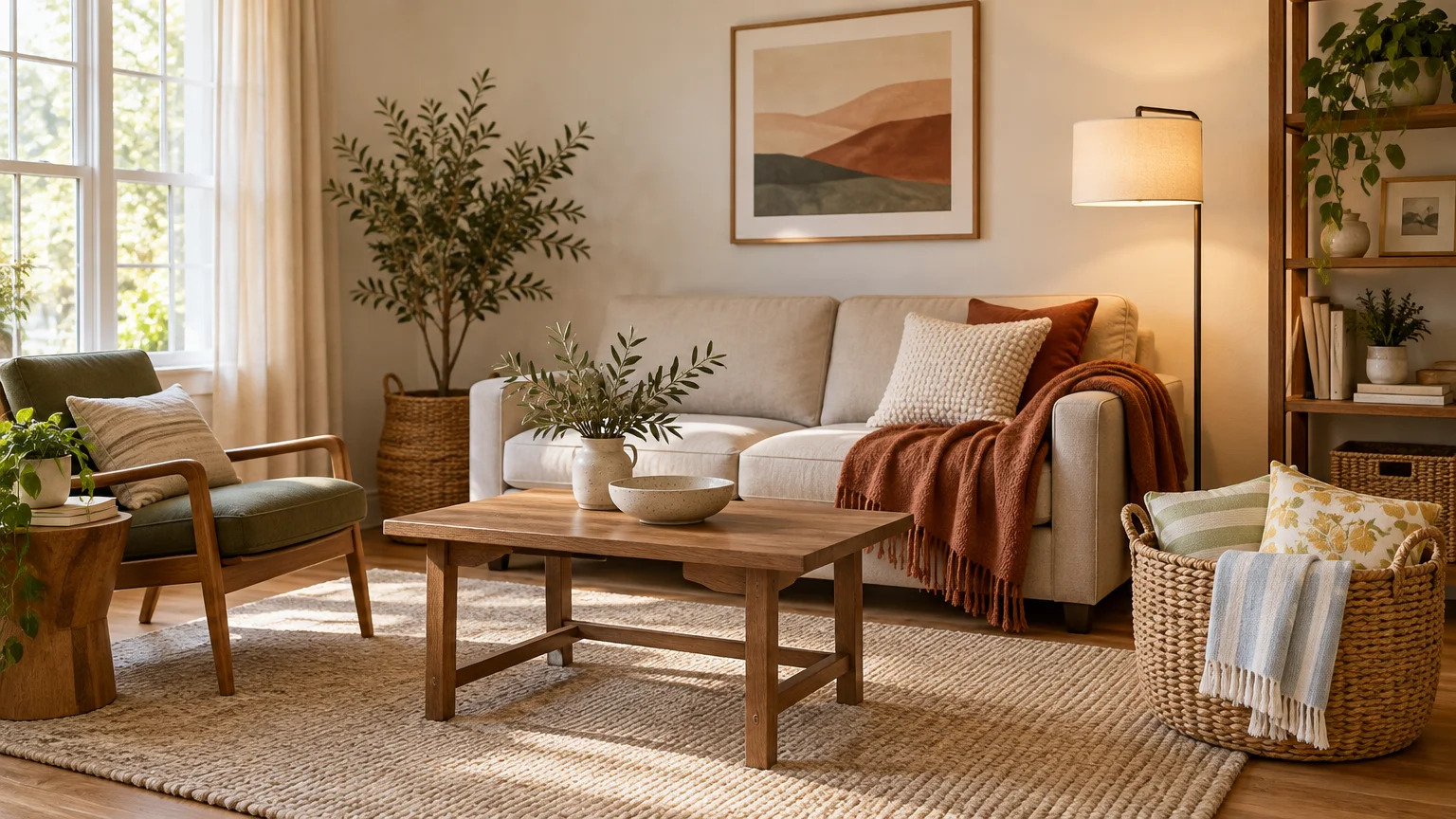
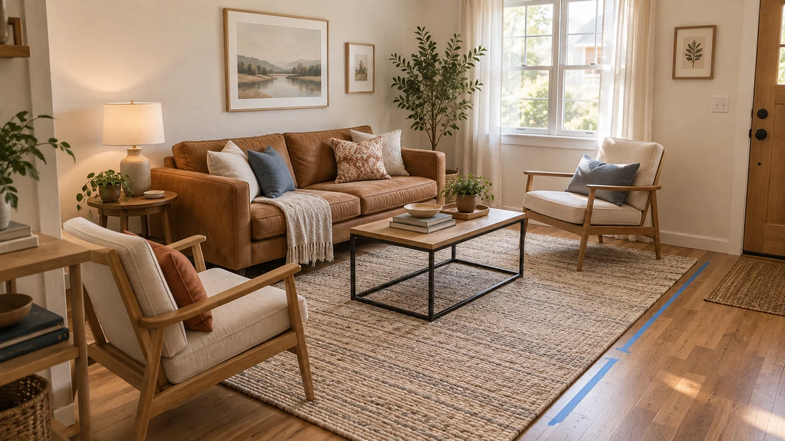
A small room does not automatically need a tiny rug. In fact, a rug that floats beneath only the coffee table can break the floor into little visual islands and make the room feel more cramped. A larger rug often creates a calmer result because the furniture reads as one connected arrangement rather than several unrelated pieces.

The goal is not to cover as much floor as possible. It is to find a footprint that looks intentional and still works with the realities of the room: a door that swings inward, a chair that needs to pull back, or a narrow route between the sofa and the wall.

The best rug size for a small room starts with the furniture

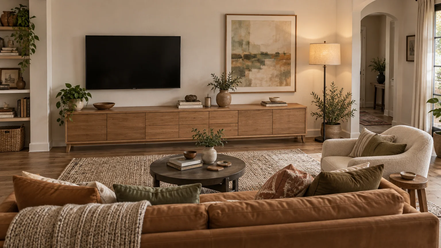
Measure the zone you want the rug to define, not just the wall-to-wall dimensions. Rugs can visually organize a seating area, dining nook, bedside zone, or work area by connecting the furnishings associated with that activity. Manufacturer guidance also treats area rugs as tools for defining furniture groupings and activity areas.

Before looking at colors or patterns, make a quick floor plan showing the furniture, doors, vents, hearths, and main walking routes. Then assess each potential rug using three checks:

  • Furniture connection: The rug should visibly relate to the main pieces in the zone instead of floating by itself.
  • Deliberate floor border: The exposed floor should look even and intentional where the room allows it.
  • Clear movement: Doors must open, people must be able to walk comfortably, and dining chairs must remain usable.

Mohawk Home suggests roughly 12 to 18 inches of exposed floor around a living-room rug, while designers cited by Architectural Digest offer broader starting ranges in some situations. These are decorating guidelines, not building rules. A narrow apartment or an off-center architectural feature may call for less floor on one side. Prioritize a balanced furniture arrangement and safe circulation over hitting one perfect number.

Small-room rug sizes to test first

The following dimensions are practical starting points, not universal prescriptions. Actual fit depends on the furniture footprint and fixed obstacles. Tape the proposed outline at full size before treating any option as settled.

Room or zone Sizes worth testing What a successful fit looks like
Compact living room 5 by 7 or 5 by 8 feet; 6 by 9 feet The rug connects the sofa and nearby chairs without interfering with circulation.
Larger small living room 6 by 9 feet; possibly 8 by 10 feet At least the front legs of the main seating can rest on the rug in a consistent arrangement.
Studio seating zone 5 by 7 or 6 by 9 feet The rug defines the living area without spilling awkwardly into the sleeping or kitchen path.
Small bedroom 6 by 9 or 8 by 10 feet; alternatively two runners There is comfortable rug exposure where your feet land, with no conflict at the doorway.
Dining nook Based on table and pulled-out chairs All chair legs remain supported during normal use.
Home office Chair-zone rug sized to the desk layout The chair can move without repeatedly catching an edge.
Entry or narrow passage Runner sized to the clear floor area Doors open freely and the rug does not pinch the walking route.

Ruggable presents 5-by-7 rugs as one possible option for small living rooms and 6-by-9 rugs for compact living rooms, but furniture placement remains the meaningful test. A room label on a product page cannot account for your sofa depth, chair angle, or doorway.

Choosing between 4 by 6, 5 by 7, and 6 by 9

A 4-by-6 rug is best for a deliberately small zone

A 4-by-6 rug can work beside a bed, beneath a compact desk, in an entry, or under a small reading chair and side table. It is harder to use successfully as the main rug in a living room because it often accommodates only the coffee table. That creates the disconnected, postage-stamp effect that makes a room look busy.

If 4 by 6 is the only size that fits without blocking a door or route, treat it as an accent rug for one defined activity. Do not try to make it visually anchor an entire seating group that extends several feet beyond it.

A 5-by-7 or 5-by-8 rug suits a compact arrangement

This range can work when a small sofa faces a media unit and there are no bulky armchairs competing for rug space. Aim for a consistent furniture relationship. For example, place the sofa’s front legs on the rug and keep other seating either similarly connected or clearly outside it.

A 6-by-9 rug often creates a more unified room

The extra width and length can bring the front legs of a sofa and one or two chairs onto the same visual field. Both front-legs-on and intentionally all-legs-off layouts can work; the problem is usually accidental placement, such as one chair balancing halfway on an edge while another floats far away.

An 8-by-10 rug can work in a small room

Do not reject an 8-by-10 rug just because the room is described as small. Tape it out. If it accommodates the complete seating group, preserves usable paths, and leaves a deliberate border of flooring, it may make the room feel simpler than a smaller rug. It becomes too large when edges run awkwardly into thresholds, prevent doors from opening, or disappear under unrelated furniture on the far side of the room.

Use the furniture-leg rule consistently

There are three common seating layouts: all furniture legs on the rug, only the front legs on it, or all legs intentionally off it. In a small living room, the front-legs-on approach is often the easiest balance between visual connection and rug cost.

Whichever layout you select, repeat it around the group as much as the furniture permits. The rug should look like a platform for the arrangement, not an obstacle that the furnishings happened to land on.

  • Place both front sofa legs on the rug rather than one on and one off.
  • Give paired chairs the same relationship to the rug whenever possible.
  • Keep a coffee table fully on the rug instead of straddling an edge.
  • Avoid positioning a rug edge directly where feet naturally pivot when someone stands up.

Rug sizing in a small bedroom

A bedroom rug does not need to reach the headboard to be useful. Placing it beneath the lower portion of the bed can provide softness along the sides and at the foot without crowding the top of the room. Mohawk Home includes lower-bed placement among its suggested bedroom arrangements.

For a queen bed, which has a nominal mattress footprint of 60 by 80 inches, orientation matters. A 6-by-9-foot rug rotated so its 9-foot side crosses the bed is 108 inches wide. Centered beneath a 60-inch-wide mattress, that leaves about 24 inches of rug on each side: (108 − 60) ÷ 2 = 24. Its 6-foot dimension can then sit under the lower section of the bed rather than extending to the headboard.

An 8-by-10 rug gives more coverage and may accommodate nightstands, depending on its placement, but it can overwhelm a tight doorway or cover nearly all the visible floor. If neither size fits the room or budget, place matching runners along the accessible sides of the bed. This gives you the practical benefit where your feet land without paying for rug area hidden beneath the bed.

Dining nooks need a different calculation

A dining rug must be sized for moving chairs, not merely for the tabletop. A rug that looks generous when the chairs are tucked in may become irritating at the first meal if the rear chair legs fall off the edge and catch when pushed forward.

Measure the table and chairs as one active footprint. Pull every chair back to the position a person would use to sit down, then measure the resulting width and length. Mohawk Home specifically advises measuring dining chairs in their pulled-out position, while Ruggable similarly recommends extending the rug beyond the table to accommodate chairs.

A taped outline is more reliable than applying one universal extension to every dining set. Chair depth, table shape, and how far people pull chairs back all vary. If the necessary rug would block a nearby door or kitchen walkway, skipping the dining rug may be better than choosing one that is too small to function.

The 10-minute painter’s-tape test

Painter’s tape or string lets you see the proposed scale before committing to a rug, an approach also recommended in the Architectural Digest rug-sizing guide. The test is especially valuable when you are choosing between two standard sizes.

  1. Measure the furniture zone and note the dimensions of each likely rug.
  2. Mark fixed constraints, including door swings, floor vents, hearths, and narrow passages.
  3. Tape the full outside edge of the first rug size on the floor.
  4. Move the furniture into its intended relationship with the outline.
  5. Open every nearby door and walk each normal route through the room.
  6. For a dining area, pull every chair out and push it back in several times.
  7. Stand in the doorway and take a photograph. A photo often makes an undersized or crooked footprint easier to spot.
  8. Repeat with the next standard size and compare the photographs.

Leave the tape in place for an evening if the choice is close. Normal movement through the room will reveal problems that are easy to miss while concentrating on measurements.

Common rug-sizing mistakes in small rooms

  • Buying by room label: A “small living room rug” may not fit your particular furniture grouping.
  • Sizing only for the coffee table: This can leave the rug visually detached from every substantial piece of furniture.
  • Forcing a tiny floor border: A larger rug is not helpful if it jams against walls, thresholds, or vents.
  • Ignoring door clearance: Check both the door swing and the rug’s actual thickness before buying.
  • Using dining-table dimensions alone: Pulled-out chairs create a much larger functional footprint.
  • Choosing an awkward custom compromise: The largest practical standard size may look more intentional and cost less than an unusual dimension.
  • Assuming every furniture leg must fit: A consistent front-legs-on layout can be entirely deliberate.

What to do when the ideal rug exceeds the budget

First, compare nearby standard dimensions instead of shrinking immediately to the cheapest rug. A plain 6-by-9 rug that connects the furniture will often do more for the room than a highly detailed 4-by-6 rug stranded in the middle.

You can also reduce the area the rug is being asked to serve. Use runners beside a bed, define only a reading corner, or move an occasional chair outside the primary seating group. What matters is that the smaller rug has a clear job. A deliberately defined mini-zone looks thoughtful; an undersized imitation of a whole-room rug does not.

Make the final decision on the floor

For a small room, choose the largest practical rug that unifies the intended furniture zone while preserving movement. Before buying, confirm that the rug connects the main pieces, leaves a deliberate floor border where feasible, clears doors and vents, supports pulled-out dining chairs when relevant, and has been tested with a full-size taped outline.

If you are stuck between two sizes, tape both. The better choice is not automatically the smaller or cheaper one. It is the footprint that makes the furniture look connected and lets the room work normally. That one measured decision can make a compact space feel calmer, larger, and much more finished.

References

  1. Finding the Right Size Area Rug | Mohawk Home
  2. Area Rug Selection by Room | Mohawk Home
  3. Rug Sizes: How to Figure Out the Best Area Rug for Your Space | Architectural Digest
  4. Ruggable Rugs Size Guide: Find the Perfect Fit for Your Home | Ruggable US
  5. Get the right size for your space – Shaw Floors | Costco
  6. Dining Table Rug Size Guide: What Size Rug Do You Need? | Ruggable US

How to Style Open Shelves Without Making Them Look Cluttered

TLDR: The simplest answer to how to style open shelves is to treat each shelf as a series of small, edited groups. Begin with the objects you genuinely use or love, place the largest pieces first, repeat a few colors or materials, and leave deliberate gaps between groups. If the arrangement still feels busy, remove the smallest or least meaningful item rather than buying another container.

Open shelves tend to look cluttered when every object competes for attention. They look intentional when a few objects lead, smaller pieces support them, and the eye has somewhere to rest. You do not need matching décor, a shelf full of beige pottery, or a shopping trip. Books, framed art, useful bowls, plants, boxes, and personal collections can all work when their placement creates a clear rhythm.

How to style open shelves using five visual tools

Before moving anything, look at the entire shelving unit rather than one shelf at a time. You are creating one composition across several horizontal surfaces. A tall vase on the upper left can balance a stack of books on the lower right, while a repeated wood tone or color can connect objects that do not match.

Recent design guidance consistently emphasizes editing open storage, varying the size and height of objects, using containers for small necessities, and mixing useful pieces with decorative ones. These are flexible design tools, not mathematical rules for how many objects every shelf must contain. For additional examples of professionally curated arrangements, see these open-shelving tips from designers.

  • Grouping: Arrange related objects as a small scene instead of scattering individual pieces evenly along the shelf. A short stack of books, a bowl, and a framed photo can read as one group.
  • Negative space: Leave visible shelf surface around or between groups. Empty space is part of the arrangement, not evidence that you have failed to finish it.
  • Scale: Mix large, medium, and small forms. One substantial vase usually creates a stronger starting point than several tiny accessories.
  • Repetition: Repeat a color, shape, finish, or material in different parts of the unit. Three separate touches of black, for example, can connect a frame, a book spine, and a small vessel.
  • Color control: You do not need a strict palette, but it helps to choose a dominant neutral or material plus a couple of recurring accent colors. Turn especially loud book spines inward only if you are willing to sacrifice easy identification; otherwise, relocate a few visually distracting books or break them into smaller stacks.

Start with function, not decoration

The best-looking shelves in real homes still have a job. Kitchen shelves hold dishes. Living-room shelves hold books and family objects. An entry shelf may need a basket for gloves or dog-walking supplies. Trying to hide every practical object can make a room feel staged, while displaying every practical object creates noise.

Empty the shelves if you can, then sort their contents into four loose categories: everyday-use items, decorative pieces, meaningful objects, and things that should live elsewhere. Everyday items deserve the easiest reach. Decorative and meaningful pieces can occupy the less convenient areas. Anything unrelated, duplicated, broken, or permanently ignored should not automatically return.

Containers are most useful when they quiet a collection of unattractive small items. Choose a basket, lidded box, file box, or opaque bin that fits comfortably on the shelf without scraping the shelf above. One appropriately sized container will usually look calmer than several little catchalls. Expert guidance similarly recommends using containers to manage small objects in open storage.

A step-by-step shelf styling method

  1. Choose a visual thread. Identify one or two colors or materials already present in the room, such as warm wood, white ceramic, black metal, blue, or brass. You are looking for repetition, not a perfectly matched set.
  2. Place the largest anchors. Start with framed art, substantial vessels, baskets, plants, or groups of large books. Distribute them across the shelving unit rather than putting every heavy-looking piece on the same side.
  3. Build smaller groups. Add one or two supporting objects near selected anchors. Try a vertical item beside a horizontal stack, or a rounded bowl next to a rectangular frame.
  4. Vary the silhouettes. Mix tall with low, solid with airy, and curved with straight. Avoid lining up five similarly sized objects as though they are waiting at a bus stop.
  5. Preserve useful access. Keep frequently used dishes, books, and supplies easy to lift without moving three decorative objects first.
  6. Step across the room. Shelf arrangements often look balanced up close but crowded from the doorway. Look for dark or busy patches and notice whether all the tall pieces have drifted to one side.
  7. Remove one thing from the busiest area. This final edit is often more effective than rearranging the entire display. Stop before every gap has been filled.

Do not worry about giving every shelf the same number of objects. Visual weight matters more than item count. A large dark planter can carry as much visual weight as a stack of books, a candle, and a small frame. Aim for balance across the full unit, not symmetry on every board.

What to change when the shelves still look wrong

Problem Likely cause Practical fix
The shelves look cluttered Too many small, unrelated objects or no clear gaps Remove several small pieces, combine necessities in one container, and widen the space between groups.
The display looks too empty Everything is small or pushed far apart Add one larger anchor, enlarge a book stack, or lean a framed print behind a smaller object.
The shelves look flat Most objects have the same height and shape Introduce one tall vertical piece, one low horizontal stack, and a rounded form.
The arrangement looks overly matched Colors, containers, and objects repeat too literally Keep the palette but vary age, texture, shape, and material. Add one personal object that breaks the set.
The shelves are attractive but impractical Décor blocks frequently used items Move decorative pieces higher and give everyday items clear, reachable zones.
One side feels heavy Large, dark, or visually dense pieces are concentrated together Move one substantial object to the opposite side or lower shelf and reassess from the doorway.

A worked example for three living-room shelves

Imagine three open shelves holding books, a small framed print, a plant, two ceramic vessels, a family keepsake, and a box of remote controls and charging cables.

On the top shelf, lean the framed print slightly off-center and place the smaller ceramic vessel in front of one lower corner. Leave the other side mostly open. That blank area gives the artwork enough importance to act as the upper anchor.

On the middle shelf, place several upright books toward one side and use a sturdy object as a bookend. Add the plant on the other side, allowing space between the books and foliage. If you want to display a small character or collectible, make it part of the book group rather than leaving it isolated in the middle. Our guide to adding mini-figures to home displays offers more ideas for incorporating tiny personal objects without letting them dominate the shelf.

On the bottom shelf, create a horizontal book stack with the family keepsake on top. Put the second ceramic vessel or the closed utility box toward the opposite side. The box keeps cables and remotes nearby without requiring them to become part of the visual composition.

Notice that the three shelves are not identical. The frame gives the top shelf height, the plant gives the middle movement, and the box gives the bottom shelf visual weight. Repeated book colors, ceramics, or wood tones make the separate arrangements feel related.

Adjust the method for different rooms

Shallow floating shelves

Shallow shelves work best with slim objects: small frames, paperback books, low vessels, and lightweight decorative pieces. Leaning art can add height without consuming much depth, but it should be stable and should not project into a busy walkway. Avoid forcing a basket or planter onto a shelf when its base does not sit fully and securely on the surface.

Kitchen open shelving

Let frequently used dishes do most of the decorating. Stacks of bowls, rows of glasses, mugs, and serving boards already create repetition. Keep everyday pieces within easy reach and reserve higher shelves for occasional serving ware or purely decorative objects. A small plant or framed print can soften the utility, but it should not make unloading the dishwasher harder.

Pantries, entryways, and craft spaces

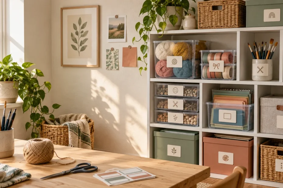
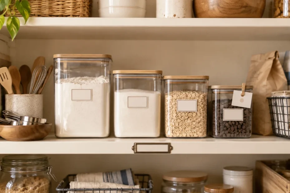
Organization-heavy shelves need stronger categories and fewer decorative interruptions. Use similar containers where visual calm matters, then label only the items that are genuinely difficult to identify. In these spaces, custom labels or decorative stickers can add a personal visual detail to boxes or bins, but choose and apply any product according to its current material and surface instructions.

Keep labels short and consistent. A pantry does not need a label on a transparent jar of pasta, but opaque bins for baking supplies, party decorations, or craft scraps benefit from clear names. The objective is faster retrieval, not covering every container with another layer of visual information.

Decorate open shelves on a small budget

Shop your own rooms first. Move a framed photo from a crowded console, gather attractive hardback books, or repurpose a small bowl as a catchall. Removing dust jackets can reveal calmer book covers, although there is no reason to alter books you value as collectibles. A clipping in a simple frame, a branch in a bottle, or a child’s small piece of pottery can provide more personality than generic shelf décor.

If you do buy something, fill a specific gap. Purchase a large basket because you need concealed storage, not because an empty shelf made you nervous. Buy a frame for an artwork you already own rather than accumulating another tiny ornament. Open shelving usually improves through editing and redistribution before it improves through shopping.

Do not overlook shelf safety

Styling advice cannot determine whether a shelf is securely installed. Follow the instructions supplied with the actual shelf, including guidance about suitable fasteners, wall material, and load limits. IKEA’s wall-shelf instructions, for example, note that wall materials require different fasteners and that suitable hardware must be chosen for the wall. Decorative arrangements should remain within the manufacturer’s stated limits.

Freestanding bookcases and applicable shelving furniture may also need anchoring, especially in homes with children. The U.S. Consumer Product Safety Commission’s childproofing guidance advises securing furniture such as bookcases and shelves to help prevent tip-overs. Anchoring is a separate task from making the shelves look balanced, but it matters much more.

The easiest next step

Take a photo of your shelves from across the room, then identify the busiest section. Remove three unnecessary objects from that area. Return the largest pieces first, create two or three small groups, and leave at least one obvious gap where the eye can rest.

Live with the arrangement for a day before filling anything else. If the shelves hold what you need, reflect something personal, and do not make the room feel noisier, they are finished. Open shelves should look collected and useful—not packed, perfect, or frozen in place.

References

  1. How to use open storage without adding to clutter – The Washington Post
  2. 8 Ways to Tastefully Curate Your Open Shelving Like a Designer, According to the Pros Themselves
  3. Advice and Instructions
  4. Childproofing Your Home – Several Safety Devices to Help Protect Your Children from Home Hazards | CPSC.gov

How to Refresh a Bathroom Without Starting a Renovation

TLDR

For a convincing bathroom makeover without renovation, concentrate on what you see and touch every day: the shower curtain, bath mat, towels, counter, storage, paint, and small hardware. Fix moisture or maintenance problems first, choose one clear color direction, and update the largest visual elements before buying accessories. The room should end up calmer and easier to use—not simply fuller of new things.

A dated bathroom rarely needs every finish disguised. It usually needs less visual noise, one stronger focal point, and better places for daily necessities. That is good news: you can create a substantial change without moving plumbing, replacing tile, or opening a wall.

Start by separating decorating from maintenance

A cosmetic refresh is appropriate when the bathroom is functional and its surfaces are sound. Pause the project if you find an active leak, soft or swollen material, recurring mold, peeling caused by persistent dampness, or a ventilation problem. The EPA advises fixing moisture problems, drying affected materials, and avoiding paint or caulk over moldy surfaces. It also recommends using an exhaust fan or opening a window while showering to help control moisture. Its guide to mold and household moisture is a useful starting point when you are unsure whether a stain is merely cosmetic.

This checkpoint is not the glamorous part of a makeover, but it protects everything that follows. Fresh paint and attractive baskets cannot solve damp drywall or a leaking supply connection.

Audit the room before shopping

Clear ten minutes and look at the bathroom as though you were entering it for the first time. Take a quick photo from the doorway; visual clutter is often easier to spot in a photograph than while standing in the room.

  • Identify the largest tired-looking element: often the shower curtain, wall color, vanity surface, mirror area, or floor.
  • Notice what is creating visual noise, including half-used bottles, exposed backup supplies, mismatched containers, and too many small decorations.
  • Write down where the routine breaks: towels land on the floor, skin-care products crowd the sink, or cleaning supplies topple under the vanity.
  • Choose one existing feature worth keeping and coordinating with, such as warm beige tile, a chrome faucet, a wood vanity, or retro pink fixtures.
  • Measure available wall, drawer, cabinet, and under-sink space before buying storage. Account for pipes, outlets, doors, and anything that must remain accessible.

Now pick a restrained direction. Warm neutral, cheerful vintage, crisp contrast, or soft spa-like can all work. The label matters less than consistency. Choose two main colors plus one metal or wood tone, then repeat them instead of introducing a new idea with every purchase.

Plan your bathroom makeover without renovation from largest to smallest

The order of work matters. A bold shower curtain can change the room more than six tiny countertop accessories, while removing clutter may improve it more than either. Start with the broad visual field and finish with details.

1. Make the shower curtain the focal point

In a tub-and-shower bathroom, the curtain is often one of the largest uninterrupted surfaces. Choose a solid color, broad stripe, or medium-scale pattern that relates to the tile. Hang it neatly, replace visibly worn rings if needed, and keep the liner on the wet side. If the room already has patterned tile, I would usually choose a quieter curtain rather than make the two patterns compete.

2. Coordinate with dated tile instead of fighting it

Old tile looks most awkward when everything around it belongs to a completely different palette. Study its undertone. Cream or tan tile can feel deliberate beside warm white, olive, rust, or natural wood. Cool gray tile works more comfortably with white, charcoal, muted blue, or cool green. Pink, yellow, and blue vintage tile can become the room’s character when repeated once in a towel stripe, art print, or small tray.

Avoid buying a fully matched bathroom set. Repeating a color two or three times looks coordinated; repeating the same pattern on the curtain, mat, towels, and accessories can make a small room feel busy.

3. Decide whether paint is worth the effort

Paint can reset a bathroom when the walls dominate the view, but use a coating intended for the room’s conditions and follow its preparation, application, drying, and ventilation directions. Benjamin Moore, for example, markets Aura Bath & Spa for high-humidity interiors and describes it as mildew resistant; that is a manufacturer claim about that specific product, not a promise that paint will correct an underlying moisture problem.

Renters should obtain permission before painting. Homeowners should first determine why existing paint is peeling. If you have leftover paint afterward, keep it in its original labeled container and check local disposal options; PaintCare notes that accepted products and drop-off details vary by location.

4. Replace worn textiles as a group

A fresh bath mat and two useful towel colors can connect finishes that otherwise feel unrelated. Prioritize washable textiles that can dry properly in your room. One practical formula is a curtain in the main color, towels in a quieter related shade, and a mat close to the floor or vanity color. The result feels layered without becoming fussy.

Treat organization as part of the makeover

A beautiful bathroom still feels unfinished when the counter cannot support a normal morning. Sort the contents into daily use, weekly use, backup stock, cleaning supplies, guest items, and things that do not belong in the bathroom.

Keep only genuinely daily items on the counter. A small tray can contain soap and two or three routine products, but it should not become a parking lot for every bottle you own. Store weekly products in a drawer or shallow bin, backups together in a cabinet, and cleaning supplies in a safe location appropriate for your household.

  • Use hooks where people tend to drop towels or robes. They are forgiving in a busy family bathroom.
  • Use a towel bar when you have enough uninterrupted wall space and want towels to hang open.
  • Add drawer dividers for small grooming items that otherwise migrate across the vanity.
  • Choose handled bins for deep cabinets so items at the back remain reachable.
  • Fit under-sink storage around the actual plumbing rather than buying a large organizer and hoping it works.
  • Keep open baskets limited to attractive or frequently used items; hidden storage is better for colorful backup packaging.

Adhesive hooks and caddies can be useful where drilling is not permitted, but “removable” does not mean universally suitable. Product lines differ in compatible surfaces, moisture resistance, installation steps, cure time, and weight limits. Check the exact instructions before installation and loading. Command’s bathroom guidance specifically directs users to product-level surface and weight information and includes cautions for certain surfaces. If you are also considering labels or decorative decals, this guide to permanent versus removable sticker adhesive explains why surface and removal needs matter.

Choose small details that earn their space

Once the large surfaces and storage are settled, add one or two finishing moves. Frame appropriately placed art, restyle the mirror area, add a compact washable tray, or swap cabinet knobs if the change is permitted and reversible. Keep the original hardware in a labeled bag so it can be reinstalled later.

Decorative labels can make matching bins easier to identify, but use materials suitable for the intended surface and room conditions. Avoid covering required product information, vents, controls, grout that must breathe or dry, and areas exposed to direct water unless the product specifically supports that use.

Be cautious with generic peel-and-stick wall coverings or decorative tile sheets. Bathrooms combine humidity, cleaning products, and splash zones, and suitability varies by product and surface. Only install one when its manufacturer explicitly permits that environment and placement. A shower curtain, paint on an appropriate sound wall, or framed art outside a splash zone is often the lower-risk decorating move.

Compare the highest-impact updates

The impact descriptions below are editorial judgments, not tested performance ratings. Renter-friendliness also depends on the lease, installation method, and landlord approval.

Update Likely benefit Renter-friendly? Main watch-out
Edit the counter and cabinets High visual and functional impact Yes Do not buy organizers until you measure
Change the shower curtain and bath mat High visual impact Usually Choose washable materials suited to bathroom use
Add hooks, bins, or drawer dividers High functional impact Often Verify mounting surface and load instructions
Paint sound walls High visual impact Permission dependent Do not paint over mold or unresolved dampness
Swap cabinet knobs Moderate visual impact Permission dependent Save the originals and match the existing holes
Add art or labels Moderate finishing impact Often Keep materials away from unsuitable wet or humid locations

A realistic weekend refresh for a compact dated bathroom

Imagine a small bathroom with beige tile, a brown vanity, chrome fixtures, and almost no closed storage. Instead of trying to disguise all four, make the beige and brown feel intentional.

  1. Check for leaks, damaged caulk, damp surfaces, or ventilation concerns before decorating.
  2. Empty the counter, vanity, and shower ledges. Discard or relocate what does not belong.
  3. Clean the room thoroughly, including the mirror, fixtures, cabinet fronts, and washable textiles.
  4. Choose warm white as the main color, muted olive as the accent, and keep the existing chrome consistent.
  5. Hang a warm-white shower curtain with a subtle olive stripe or border.
  6. Add solid olive or cream towels and a simple mat that does not compete with the tile.
  7. Place daily products on one compact tray. Move weekly products into a measured drawer divider.
  8. Add an appropriately mounted towel hook only if the selected product is approved for the surface and expected load.
  9. Finish with one small art piece outside the splash zone rather than several tiny decorations.

This plan does not pretend the tile is new. It edits the room until the existing finishes look like part of a palette rather than unrelated leftovers. Just as importantly, it improves where towels and products go.

Common mistakes that make a refresh feel unfinished

  • Shopping before decluttering, which creates new storage for things you may not need.
  • Trying to hide every dated feature instead of choosing one to work with.
  • Using too many small accessories when one strong curtain or paint color would have more impact.
  • Assuming any adhesive product will work on tile, painted walls, or humid surfaces.
  • Putting paper prints, untreated wood, or unapproved adhesive coverings where they receive direct splashes.
  • Mixing several competing metals, patterns, and accent colors in a small room.
  • Decorating over peeling paint, recurring mold, failed caulk, or water damage.

Make the room calmer before making it newer

The best no-reno bathroom refresh changes the room’s hierarchy: fewer bottles catch your eye, the curtain becomes a deliberate focal point, textiles connect the existing finishes, and everyday items finally have sensible homes.

Start today by clearing the counter and taking one doorway photo. Then choose the single largest visual change and the single storage problem that causes the most daily friction. Solve those two things first. That is usually enough to make a bathroom feel intentional without allowing a decorating project to turn into a renovation.

References

  1. A Brief Guide to Mold, Moisture and Your Home | US EPA
  2. Aura® Bath & Spa Waterborne Interior Paint – Matte Gallon Lampblack CW-695 | Benjamin Moore
  3. Get the Answers to PaintCare's Frequently Asked Questions
  4. How to use Command™ Bathroom Solutions
  5. Have questions? Check out Command™ FAQs | Command™ Brand